Worst Video Game Covers Of All Time
We may receive a commission on purchases made from links.
Back in the days before YouTube, there were only a couple of ways to know what any video game was actually about. You could borrow it from a kid at school, read about it in a magazine, or (if there were absolutely no other options) you had to go against all conventional knowledge and judge the game by its cover. Some video games have covers that are exciting works of art enticing you into the action, but others have covers so bad that it's a miracle they sold any copies at all. Here are a few of the worst video game covers of all time.
Mega Man
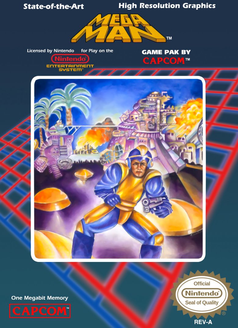
When it comes to terrible box art, Mega Man is the champion. Even though Capcom pretty much revolutionized the run-and-gun genre with the series, the first game's U.S. version has one of the ugliest packages of all time: a splay-legged, oddly proportioned hero stands in a tropical wonderland, twisted gun at the ready, prepared for anything. Nothing on the cover represents anything in the game, and it gives off a distinct "8th grade art project" vibe. It may have scored bronze at the local Kreative Kidz Art Jamboree, but it has no place as a video game cover.
This Mega Man is so bad that he's actually become a running joke. "Fat" Mega Man or "Bad Box Art" Mega Man's most notable appearance is in Street Fighter x Tekken, where he's properly depicted as an overweight, middle-aged man with a crooked helmet. He almost made an appearance in Mega Man Universe, too, before the game was canceled. Either way, lopsided Mega Man is regarded as the worst mistake in Nintendo game art history, and rightfully so. That dopey dude isn't conquering any mad scientists any time soon.
Legend of the Ghost Lion
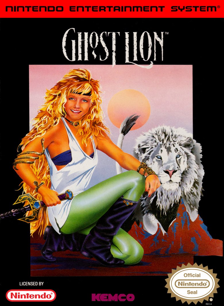
While the Famicom version of Legend of the Ghost Lion got a cool, '80s anime cover (much like Mega Man), the U.S. Nintendo version decided to take another creative direction. Instead, the game most critics agree is a bad Dragon Warrior ripoff got a cover that didn't say "fantasy adventure" as much as "aerobics tape." Sure, the promise of a lion that's also a ghost sets up the premise for an incredible adventure, but the early '90s fitness model in stretchpants and a headband pretty much kills the action-y, swordfighting vibe. At its best, it's almost the cover for a forgettable soft-rock band, but at its worst, it just looks like a game about cardio and crunches.
Batman: Arkham City: Game of the Year Edition
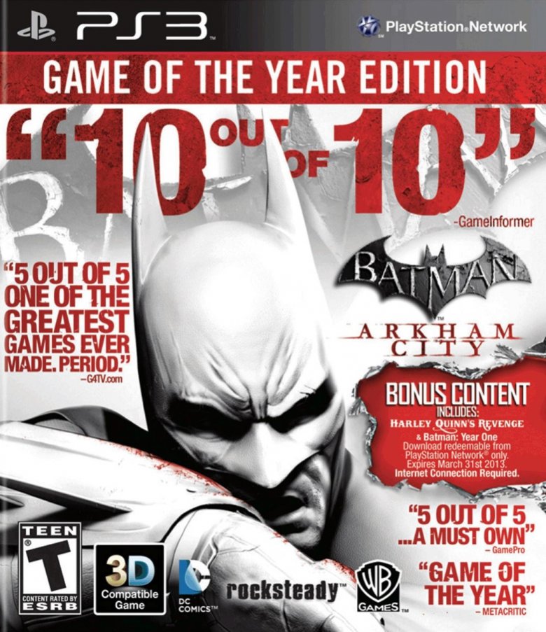
Batman: Arkham City is a great game, and the folks at Warner Bros. Interactive Entertainment want you to know it. They're less interested in letting you know which game you're actually buying, however. After Warner Bros plastered review scores and pull quotes all over Arkham City's "Game of the Year" edition (don't get too excited — all kinds of games get "Game of the Year" editions, whether they actually won Game of the Year awards or not), there wasn't much room left for important details — like the game's title.
On one hand, Batman's glowering mug is all that most customers really need to see to make an informed purchase. On the other, it'd be nice to know what actually comes in the Game of the Year package, especially if you bought the bare-bones Arkham City game earlier. Given just how much text is on Arkham City's cover, that's hard to figure out. But hey, G4TV (which stopped publishing reviews shortly after giving that quote in 2011) thinks it's one of the greatest games ever made. With that kind of praise, who even cares about the content, right?
Palamedes
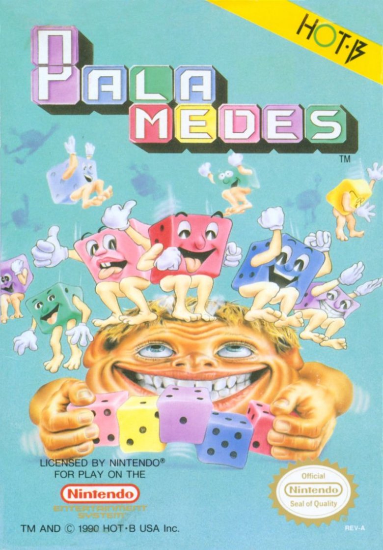
With apologies to publisher Taito, almost everything about Palamedes is hot trash. You're not getting a great start when your game is about playing dice, but depicting a series of sentient dice curbstomping a player in front of a creepy, baby-blue background is no way to entice anyone into your sad, sad game. Sure, Taito gets bonus points for at least trying to make a dice game look like it's exciting, and even more bonus points for not being afraid to get weird, but it quickly loses every point earned by putting the game's instructions on the cart itself, instead of a label. You know, the cart that's immediately trapped in the unviewable, hot darkness of the NES once you plug it in. It may be a slightly interesting puzzle game, but damn, everything about it is ugly.
Irritating Stick
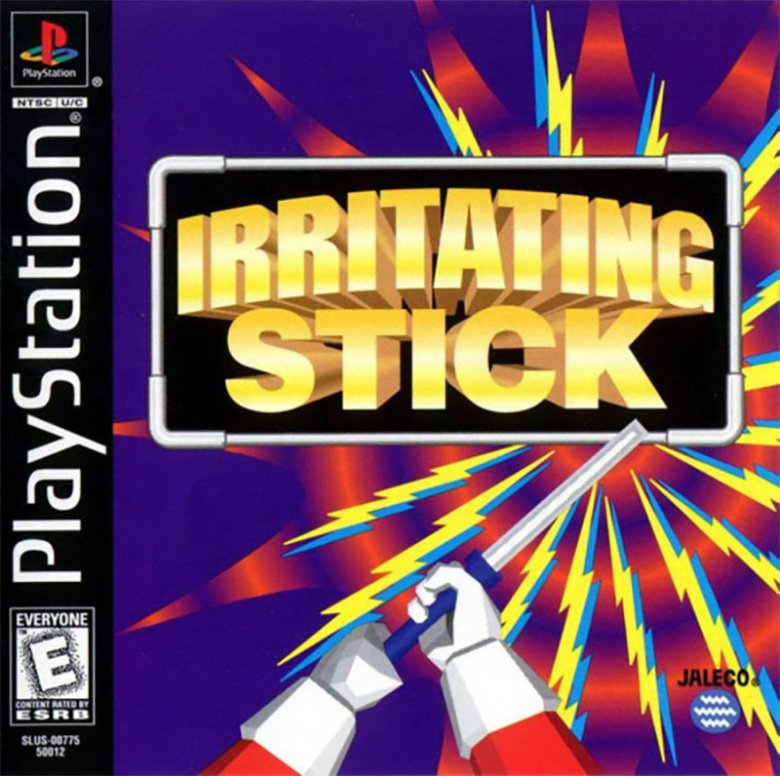
Many of these covers veered too far from the games they represent. Irritating Stick is a little too literal. In the picture, a pair of hands hold a stick. It gives off an electric shock, which, yeah, probably is irritating for anyone on the other end.
But that's it. No main character. No setting or story information. Just a stick and some energy bolts. With a title like Irritating Stick, customers need a little more information to go on. For example, Irritating Stick is based on a Japanese game show. It asks players to guide a charged rod through a metal maze. Touching the edges causes a minor explosion. A talented artist could've incorporated some (or all!) of those elements into the cover image to help explain what the heck the game is about.
Maybe it wasn't worth the effort. Reviews claimed that Irritating Stick was just as strange and dull as its name — which was incidentally ranked the worst title for a video game ever.
Mr. Gimmick
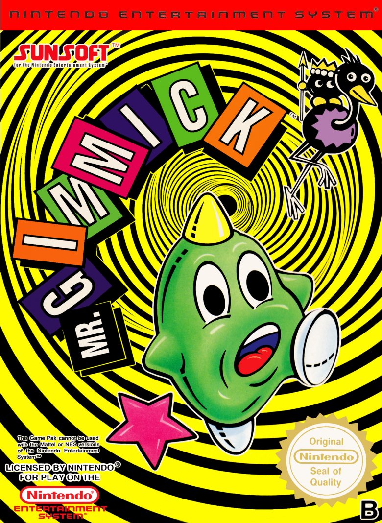
Once again, the rest of the world gets shafted when it comes to a great video game. When it came to the limited processing power of the Famicom, the Japanese version of Mr. Gimmick broke through barriers in both programming and music. Basically, it's a Super NES game crammed into a Nintendo cart.
Not only did the release of Mr. Gimmick outside Japan never hit the States, but it was also incompatible with American NES systems due to the fact that it was only formally released in PAL format. The game's elaborate soundtrack was simplified, which is a unique crime against gaming, but worst of all, the game's adorable protagonist, Yumetaro, was absolutely destroyed for the non-Japan release. Instead of being depicted as a lovable, horned ball, the Nintendo Yumetaro is a screaming, dead-eyed, distorted ball of terror escaping a formless vortex. As far as video game heroes go, this Mr. Gimmick seems more prepared for the sweet release of the grave than an adventure.
Bram Stoker's Dracula
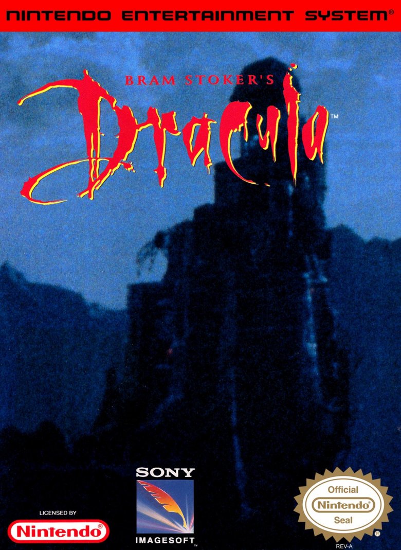
There are many, many strange NES adaptations of R-rated films, but even stranger than Hudson Hawk or The Untouchables is Bram Stoker's Dracula. Nintendo wasn't afraid to cater to a slightly older audience with titles like Taboo: The Sixth Sense, but a film about a weird, psychic, quasi-demonic rapist went above and beyond Nintendo fare. However, for a movie about a shape-shifting monster, ancient evil, topless Victorian ladies, and even an awesome Tom Waits cameo, Nintendo chose a blurry, underexposed shot of Drac's castle for the cover. Or at least we're meant to assume it's his castle; the photo is so poor that it's impossible to make out any details. Of course, a game based on the well-known legend of Dracula probably sells itself, but this cover gets an D for effort. And for Dracula. And for "Don't bother with this Castlevania ripoff."
Chuckie Egg 2
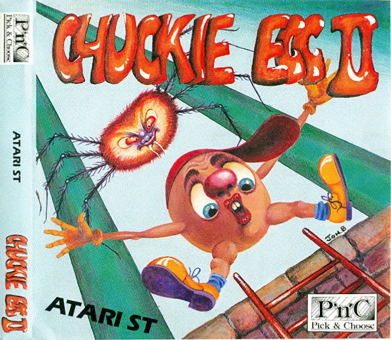
Chuckie Egg 2's Atari ST cover art is absolutely terrifying. Considering that the game follows Henhouse Harry, who reprises his role as hero from the first Chuckie Egg, as he gathers the ingredients he needs to build a chocolate egg, it's also strangely off-brand. The oddly human egg in the image isn't chocolate, and he (or she — it's hard to say) dressed with a unique take on mid-'80s style that the game itself simply doesn't have.
Besides, Chuckie Egg takes place in a candy factory, not Humpty Dumpty's wall. (Is the egg committing suicide by intentionally jumping off?) And then there are the weirdly muscular legs, the bump on the egg's crotch that's probably supposed to be a chin but looks like something else, and the baboon-spider lurking in the background. The less said about those, the better.
Karnaaj Rally
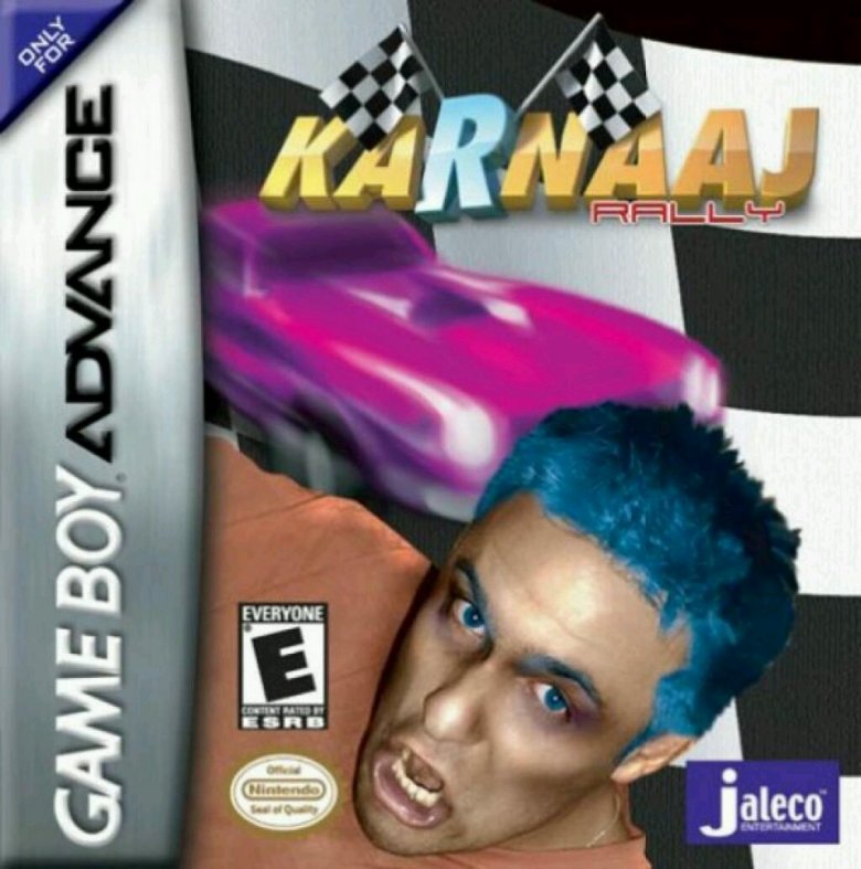
Nobody knows why Jaleco Entertainment decided to take a picture of a bargain basement Zoolander impersonator, Photoshop him so that he has blue hair and a mannequin's sheen, and then put him in front of a blurry pink hot rod. Nobody's quite sure what "Karnaaj" means, either, although the best guess seems to be that it's a unique and edgy take on "carnage." Either way, Karnaaj Rally's box art isn't just terrible — it actually hurt the game's review scores.
IGN, which really liked the game, leads its Karnaaj Rally review by warning players to "look past [the] game's box art and name" and enjoy the chaotic, violent racing title inside. Over at EGM, critic Seanbaby took things even further, reviewing the game based on its package alone. Fans complained. So did the publisher, which demanded a retraction. Seanbaby's reply, which wasn't printed in the magazine, pushes back: "If the creators don't like how I reviewed the box of their game, suck it." He admits, however, that he tried the game, and that "it wasn't as bad as it looked like it'd be." With box art like Karnaaj's, that's a low bar to clear.
Fire 'N Ice
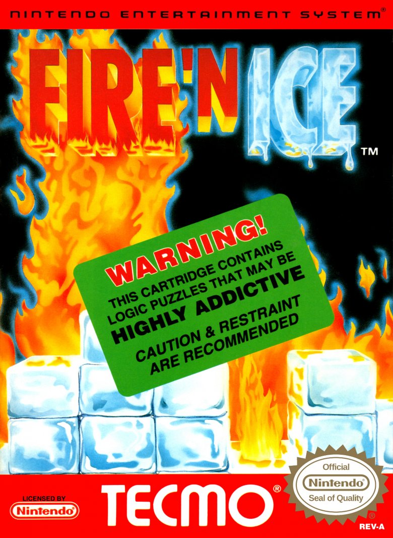
A wizard. A princess. A sprawling Super Mario Bros. 3-like map. A gargantuan megaboss covered in the bones of his enemies. The perfect recipe for probably the most epic video game cover of all time, right?
Instead, Tecmo went with the theme "wet Tetris" for its Fire 'N Ice cover. Instead of even fully showing the eternal conflict between the titular fire and ice, Tecmo decided to slap a big, green warning label across the game instructing you not to play it, lest you become addicted. Granted, Tetris-mania was still in full swing in 1993, despite the best efforts of Dr. Mario to conquer the disease in 1990, but actively warning against addiction, at the height of the Just Say No! campaign, all while obscuring the game's only visible graphics, was a bonehead move. And not the cool kind of bonehead the game's actual boss has.
Eliminator Boat Duel
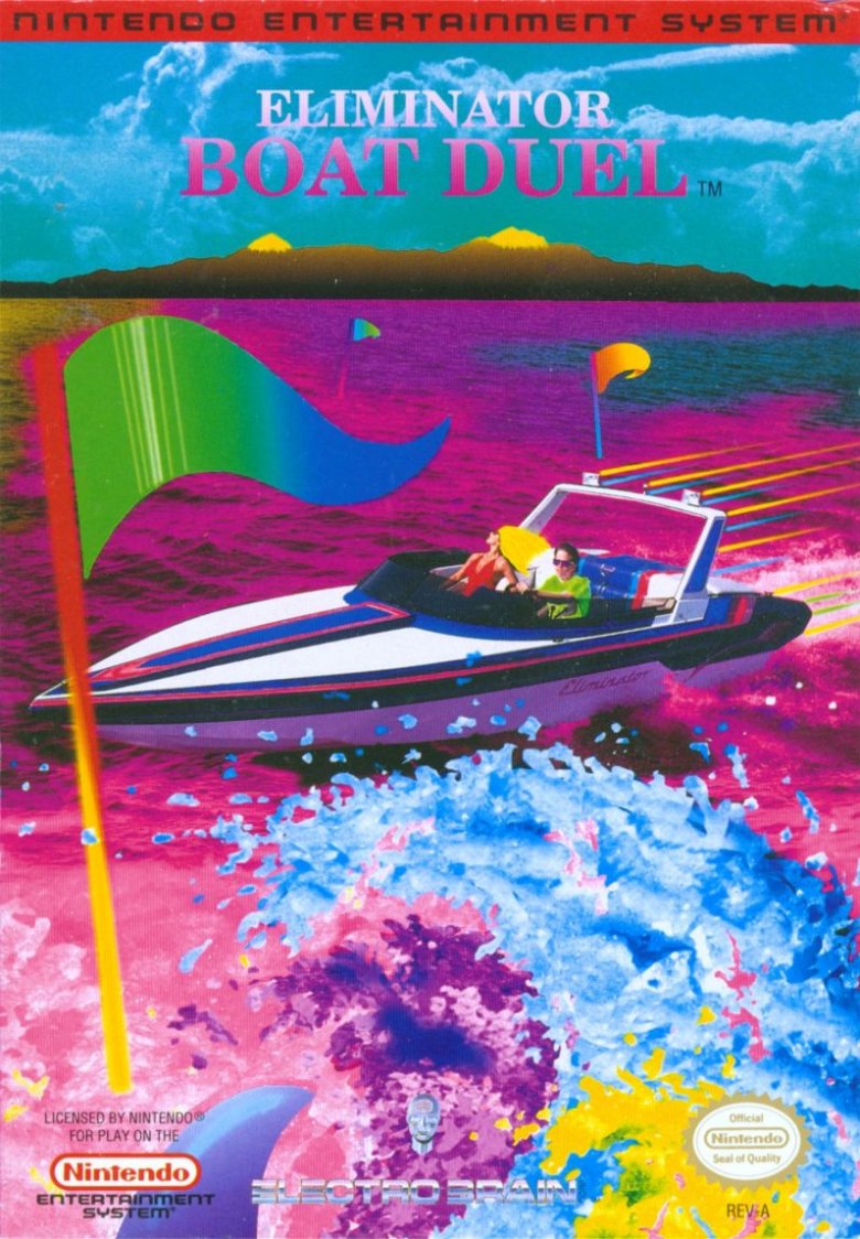
You're a super cool boat owner who's just tripped on the world's most intense acid. Your goal is to make your way through an aquatic, psychedelic dreamscape without killing yourself or your glamorous, bikini'd passenger. Oh, and there's an occasional lake shark.
At least that's what the technicolor disaster that is the cover of Eliminator Boat Duel wants you to think, with its weird mix of photography, illustration, and bizarre rainbow filters. Instead, you're just a jerk on a boat, trying to drive your boat faster than other boat jerks, and in the end, you get the pretty, blonde girl as your trophy. It's standard racing fare, but the game's nightmarish cover is a visual abomination by any account.
Dynamite Duke
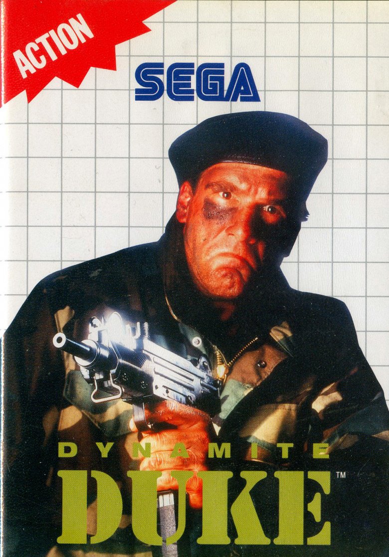
Dynamite Duke stars a blond super-soldier with a mechanical arm. Dynamite Duke's box art — at least Sega's version — stars someone (a Sega employee, probably, or maybe somebody's uncle) in the laziest "army" cosplay you'll ever see. You know Duke (full name Duke Rippem) is in the military because he wears a camouflage jacket. You know he's in special ops because he wears a beret and eye black. You know he means business because he holds a gun.
Mr. Duke also looks so, so sad. Maybe he's bummed that he doesn't look anything like his in-game counterpart. Maybe he's disappointed that Dynamite Duke isn't a very good game. Maybe he's unhappy because, according to Dynamite Duke's manual, the hole in the ozone layer has gotten so big that UV rays are frying U.S. citizens left and right.
At least the game isn't as somber as its cover. It's full of action. You know that because it says so right in the corner. Thanks, Sega!
Every game by Phoenix Games
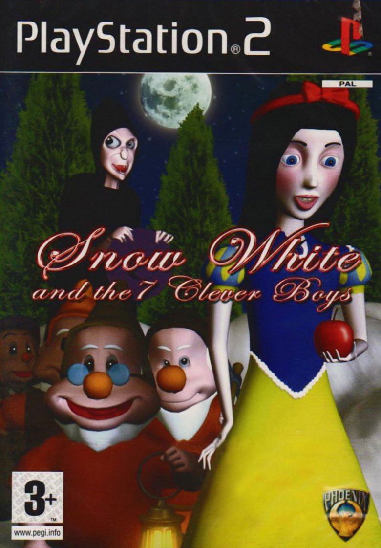
For bad box art connoisseurs, Phoenix Games' library is the ultimate treasure trove. Every single one of its games (and there are a lot of them) sports a gloriously terrible cover. Apparently, the games themselves aren't much better. London Cab Challenge is just Crazy Taxi without a rocking soundtrack (or any other redeeming features). In White Van Racer, you drive a white van in some races. Why a white van specifically? You'll never know.
And then, there are Phoenix's fairy tale-based titles, which shamelessly rip off classic Disney films. Look at the cover for Snow White and the 7 Clever Boys, for example. It is, quite simply, Walt Disney's hand-drawn masterpiece, as seen through the eyes of someone who's never made a 3-D model before but who doesn't see that as an obstacle. Even the name makes no sense. Disney might own the Snow White and the Seven Dwarfs title, but the Snow White story itself is in the public domain. Calling them dwarfs is probably okay.
Sadly, it's a moot point. As far as anyone can tell, Phoenix Games filed for bankruptcy in 2009, robbing the world of future masterpieces. Alas. At least we'll always have Dalmatians 3, Adventures of Pinocchio, and Paccie to remember them by.
Dangerous Streets
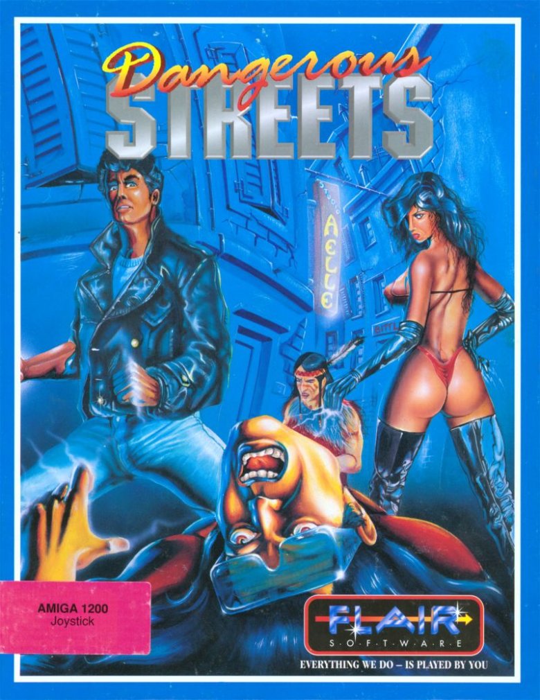
A word of warning to the pubescent boys who seem to be Dangerous Streets' target audience: boobs don't really work that way. They don't curve around a woman's body, or jut out from her chest at a perfect 90 degrees. It's not possible for a woman to display her breasts, her butt, and most of her face from the same angle unless she's a contortionist or lacks a spine. Sorry, kids. Dangerous Streets is lying to you.
On the other hand, judging by the screenshots, if you do get your jollies through impossible anatomy displayed in 1994's version of HD, Dangerous Streets might be the game for you. Like the cover, Dangerous Streets features female fighters decked out in clothes that only kind of cover their naughty bits (aside from the one woman who wears a skin-tight catsuit that covers everything except the R-rated parts, which are highlighted with decorative yellow dots). Questionable racial stereotypes, like the cover's Native American warrior, show up, too. Dangerous Streets' cover art is bad in a whole lot of ways, but at least it accurately portrays the game inside. That's not much, but it's something.
Ninja Golf
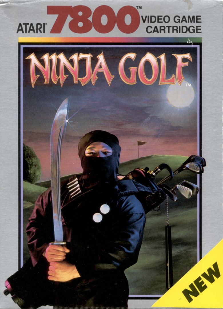
If you've played golf before — and maybe even if you haven't — you might notice a few things wrong with Ninja Golf's cover. For one, it's not a game you play at night because both the ball and the hole would be very hard to see. For another, both katanas and nunchucks fall outside of the United States Golf Association's rules about what you can and can't use as a golf club. But, ya know, golf is also pretty boring. At least with ninjas, there'll be some action.
See, regulation-violating equipment aside, Ninja Golf's box art is only half as weird as the game it represents. In Ninja Golf, players hit their ball toward the hole. Then, while they're traveling to the ball to set up their next shot, they fight off the enemies they encounter along the way. Obstacles change according to the environment, too. If the ball is stuck in a sand trap, the player will battle snakes. If the ball is submerged underwater (which would usually require the player to take an extra stroke and drop a new ball), they'll encounter sharks. Ninjas, Wikipedia's entry on the game says, "are encountered in all the environments."
Ninja Scooter Simulator
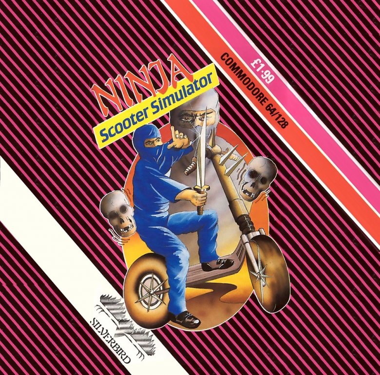
Amazingly, Ninja Golf and Ninja Scooter Simulator aren't made by the same company. The former came from Blue Sky Software, which is probably best known for developing the Sega Genesis version of Jurassic Park. The latter came from Sysoft, which also made Beach Buggy Simulator and apparently not much else.
Still, the developers' overall philosophy seems about the same: take something boring — in this case, mopeds — and liven it up by adding ninjas. Unfortunately, Ninja Scooter Simulator limits ninjas to the box art only. In the actual game, you'll control a sunglasses-wearing man in very loud pants as he jumps over ramps and dodges dune buggies, skeletons, and mobsters. Despite the title, there's not a single ninja on a scooter to be found.
Maybe that's intentional. Ninjas don't ride mopeds in the real world, either. Maybe Sysoft simply wanted this "simulation" to be as accurate as possible.
Russell Grant's Astrology
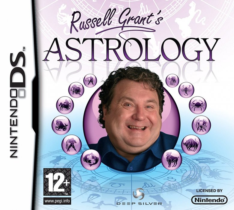
If you don't know Russell Grant — and boy, are you missing out — here's a quick primer. He made his public debut in 1979 and was a fixture on British television throughout the '80s, '90s, and '00s, where he presented astrologically informed advice on programs like Breakfast Time, Good Morning Britain, and Bingo Night Live. In the '00s, Grant branched out into general television hosting, presenting serialized specials like Russell Grant's Sporting Scandals and the celebrity-focused psychic showcase The Russell Grant Show. He's also appeared on Britain's editions of Celebrity Fit Club and MasterChef, as well as the celebrity dance competition Strictly Come Dancing.
In short, he's exactly the kind of celebrity you'd expect to endorse a cheaply made budget title, and by all accounts, Russell Grant's Astrology doesn't disappoint. Official reviews of the title are hard to find, but over on Amazon, customers offer glowing reviews like "I like it" and "funny and useful." Of course, Amazon also replaced the box art, featuring Grant's leering image, with a totally unrelated (we assume) picture of a frying pan, so maybe that's not the most trustworthy source of reviews.
Hungry Horace
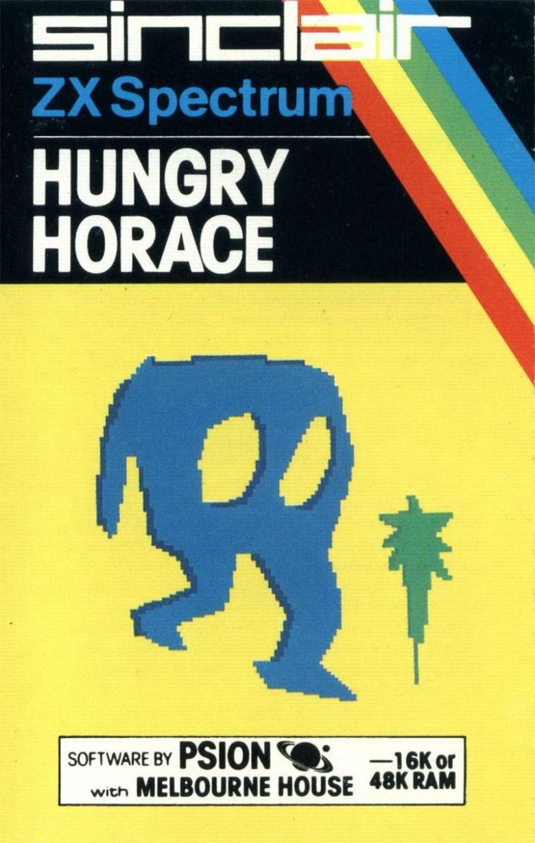
For the most part, video game mascots are easy on the eyes and feature clean, easy-to-read designs. Mario is a plumber. Sonic is a hedgehog. Bonk is a caveman. Conker is a squirrel. Gamers generally despise Bubsy, but he's clearly a bobcat. Heck, Pac-Man might just be a circle with a mouth, but at least he's nice to look at.
And yet, Horace's odd design — or lack thereof — didn't stop Horace from becoming a minor gaming icon in the '80s (in case you're wondering, he looks exactly like that in-game, too). Hungry Horace, a middling Pac-Man clone, managed to make its way to a number of popular retro consoles, including the ZX Spectrum and the Commodore 64. Horace Goes Skiing, a Frogger knock-off, made Eurogamer's list of the most influential ZX Spectrum games. Horace and the Spiders is a simple Donkey Kong-like platformer. Horace even had cameos in other titles, including Inspector Gadget and the Circus of Fear and the PlayStation 2-exclusive Dog's Life.
Or, to put it another way, it's not hard to create the next big gaming icon. All you need is a little bit of gumption and the artistic skills of a 3-year-old.
Street Hockey '95
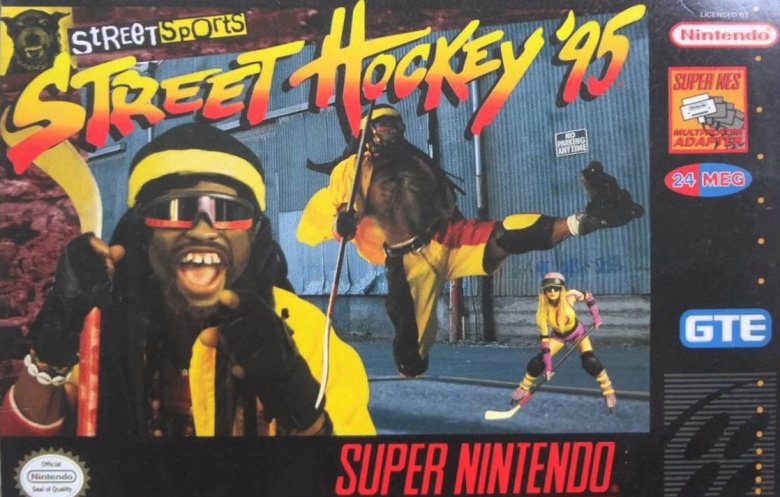
It's not that folks at GTE Interactive Media, the company behind Street Hockey '95, are racist, exactly. It's just that if "street" makes you think of a black man with dreadlocks and bad teeth, and if you're so committed to the idea that you put the dude on your cover twice, you might be playing into stereotypes a little too hard.
Of course, it's not like the "hockey" part of Street Hockey '95 fares much better. Instead of doing something hockey-related, Street Hockey '95's mascot simply leaps in the air and unleashes a stiff kung-fu kick. He's wearing inline skates and holding a hockey stick that looks more like a staff, but that's about it.
Only his teammate, the busty blonde standing behind him, looks like she's ready to play the actual sport she signed up for. On the other hand, she's really only there to bend over and show off her cleavage. Thanks to some weird perspective issues, she appears to be 3 feet tall. Buckle up, folks. This is going to be one weird hockey game.
Captain America and the Avengers
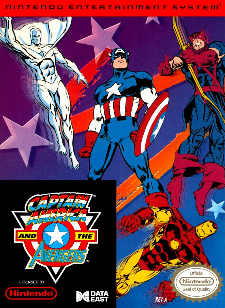
In 1991, Marvel Comics was employing a pretty solid stable of revolutionary comic book artists, so there's absolutely no reason the company should have allowed the home port of Captain America and the Avengers to be a terrible collage of clip-art. It happened anyway. While the arcade version allows players to choose from four different heroes, Nintendo's version only lets you pick between Captain America and Hawkeye. Yes, Hawkeye. Over Iron Man.
To top off the crap package, Data East took a scribble, cut out four superheroes from their comics, and slapped them just about anywhere they wanted on the cover, with Iron Man desperately trying to jockey into position between Nintendo's logo and the unnecessarily enormous black box that bears the game's title. It's an education in what not to do when you're designing, and possibly for what happens when you wait until the last minute to turn in your game art homework. It's not pretty.
Pure Pinball
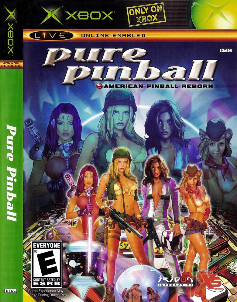
Remember that really hot game of pinball you played? No? There's a reason for that. Pinball is a great and addictive game but, Roger Daltrey aside, it's not exactly not known for its sex appeal.
If you only knew pinball from Pure Pinball's box art, however, you would think that it's the Baywatch of the arcades. Put in a quarter, and watch the buxom babes come running. At least the cover for Pure Pinball — which, packaging aside, turns out to be a pretty decent pinball simulator — relates to the game itself. As indicated by the "American pinball reborn" tagline, Pure Pinball features four different tables, each based on an element of American history: war, racing, trains, and space. And, sure enough, the models on Pure Pinball's cover art are dressed as a soldier, a racecar driver, a cowgirl (trains are big in Westerns), and a sexy alien warrior. See, it's not cheesecake. It's symbolism.
Campaign '84
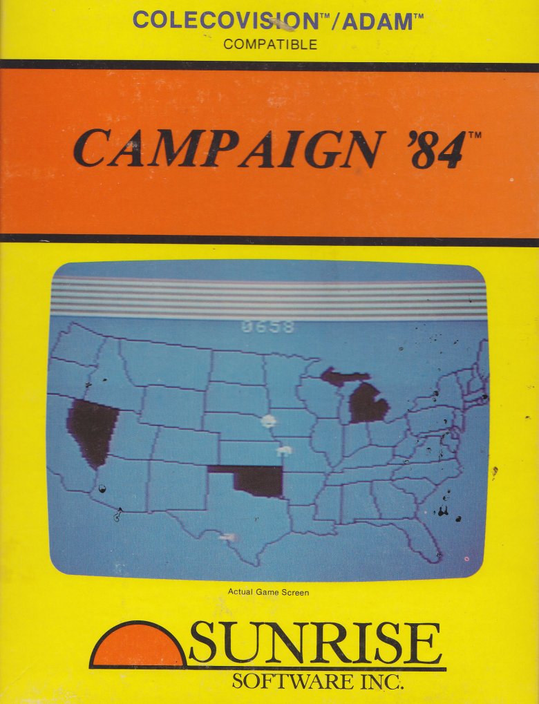
Many titles here would be best served by using a screenshot from the game itself instead of whatever cheap, nonsensical design the marketing team came up with. If you want to convey how exciting your game is, show the game's explosive action, right? If it's a horror title, let people know how scary it is. And so on.
Campaign '84 is not one of those games. Not that it's bad, at least not if you're a political junkie. Players choose which issues they're going to focus on as a U.S. presidential candidate and then travel around the country, hoping to secure as many electoral votes as possible before Election Day. Campaign '84 is actually a lot of fun, and it's got a wicked sense of humor to boot — in the game, controversial campaign issues include whether dogs should be the national pet (yes), if the government should ban shoes with laces (absolutely not), and squirt gun control (it's complicated).
But visually, Campaign '84 looks more like middle school social studies homework than a fun and quirky simulation. That's not a compelling pitch for a game. Points given for honesty, but Campaign '84 would've benefited from giving the cover designers a little bit of artistic leeway.
Road Runner
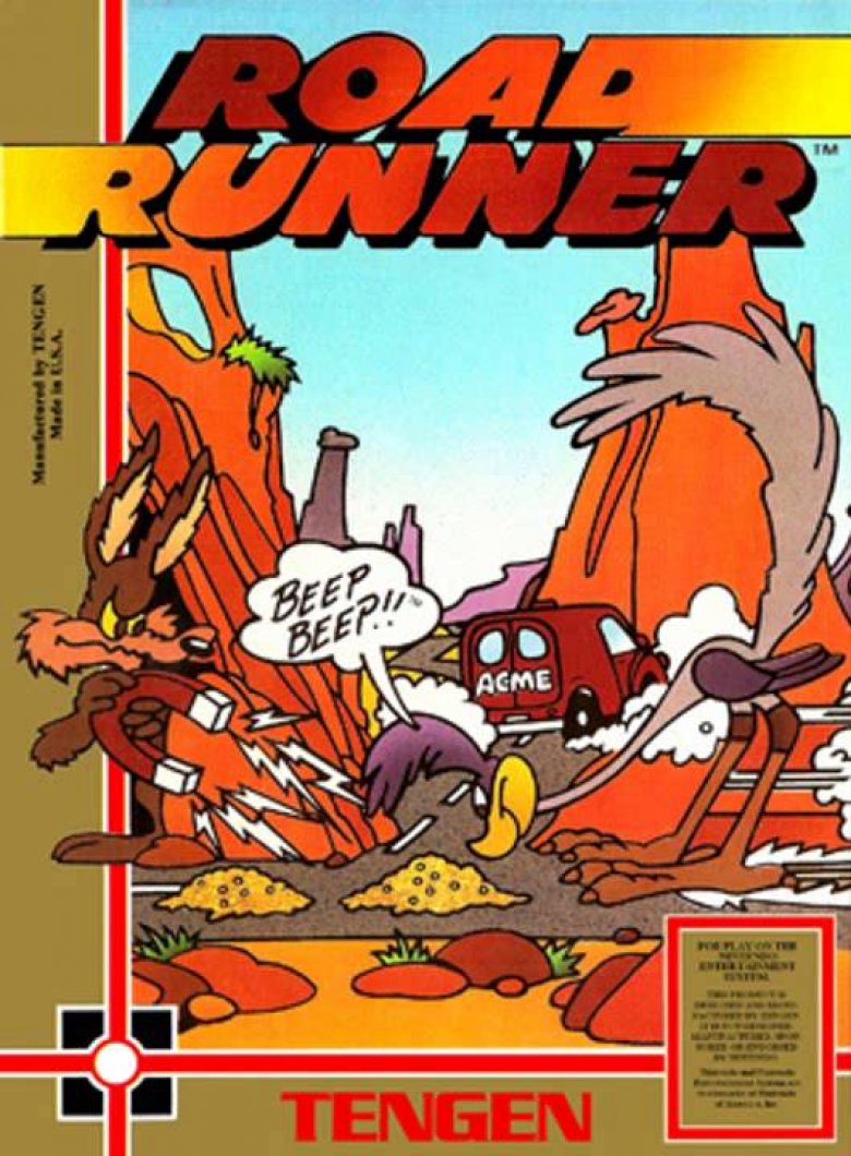
By most accounts, Atari's Road Runner is a pretty average game, with a weirdly grating soundtrack and uninteresting play, but somehow Tengen's home version of the arcade game managed to be extra terrible. Tengen, an offshoot of Atari, was probably the most prolific producer of unlicensed NES games, and it produced more games of higher quality than anyone else when it came to off-brand Nintendo. But when it came to Tengen's version of Road Runner, Tengen couldn't get the license to publish for the Nintendo and couldn't even use the game's legit artwork like it could for other home releases. The result looks like a $25 tattoo: a terribly traced version of the real thing, and very, very wrong.
Konami's Best: Castlevania: Dawn of Sorrow
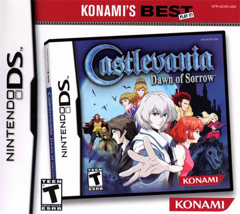
This is either a brilliant meta-commentary on the nature of video game re-releases, or the laziest video game cover ever created. Possibly both. When Konami decided to re-release its excellent Castlevania: Dawn of Sorrow under the Konami's Best banner, the company didn't simply take the existing art and slap a banner on top of it. No, instead, someone took a photo of the original game's case, and then put a banner and trade dress on that.
Or, to put it another way: the picture on the game cover is a picture of the game cover. It's not going to get weirder than that. Pack it up, folks. We're done here.