

The 5 Trippiest Album Covers In Psychedelic Rock History
We may receive a commission on purchases made from links.
Whether it's the inclusion of sitars into tracks, egregious wah pedal use, swishy sound effects, or meandering solos, psychedelic rock and the '60s went hand in hand. So did whackadoodle, trippy album covers like what we saw from Cream, the Beatles, and the Rolling Stones. At this point, we've been blessed with decades of art from psychedelic rock's entire history.
But how do we chose the best covers? First, we don't want to limit our definition of "trippy" solely to swirly, kaleidoscopic colors that look like rainbow paint drizzled into a whirlpool. We're keeping a general eye out for the most surreal, disorienting, bizarre imagery that looks like something you might encounter in a dream. Such artwork doesn't have to come from a psychedelic band, but that's the combination we're focusing on. Sadly, this means omitting stellar choices like Miles' Davis "B****** Brew" (both front and back covers).
And because the genre never went away, only faded from the limelight past its 1967 psychedelia heyday, our choices run all the way to the present. We're also not going with familiar, predictable choices like Jimi Hendrix's "Axis: Bold as Love" unless it truly beats the competition. Quality of music is not the point here, either — only artwork. However, the two can definitely support each other. So, prepare to have your mind altered as you peer into the beautiful madness of some of the trippiest clashes of form, line, and color to ever grace rock albums.
Abraxas — Santana
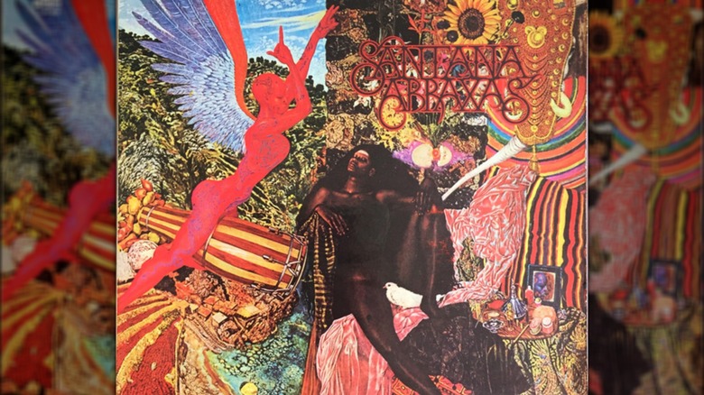
We always knew that Carlos Santana had a bit of the weird in him, right? Right down to mystically, magically-coded song names like "Singing Winds, Crying Beasts" from 1970's "Abraxas" — a release from the best year of his career. The album cover features a collage of tribal imagery associated with the Wodaabe people of Niger, vibrant colors, a central goddess-looking version of the Virgin Mary attended by a red angel in profile riding a big conga drum, mountains and trees and huts in the background, and tons of other details. And that's just the front cover.
What in the world does this cover mean? Well, it's actually the 1961 painting "Annunciation" by Mati Klarwein, which Santana came across in a magazine back in the day (Klarwein also did Miles Davis' "B****** Brew" on commission). Santana had been reading Herman Hesse's "Demian" at the time, a 1919 coming-of-age story about a boy, Emil Sinclair, challenging preconceptions about morality, sexuality, human nature, etc., ahead of World War I. As Poppodium Boerderij says, one sentence stuck out in Santana's mind and made him connect "Demian" to "Annunciation" ahead of releasing "Abraxas": "We questioned the painting, berated it, made love to it, prayed to it: We called it mother, called it w**** and s***, called it our beloved, called it Abraxas ..." Abraxas, itself, is a whole other, abyssal rabbit hole of sacred letters connected to 2nd-century Gnosticism — Christian mysticism that shares roots with Judaism and Greek Platonism. What does this all mean? It means that the explanation behind "Abraxas'" cover is just as wild as the cover itself.
The Inner Mystique — The Chocolate Watchband
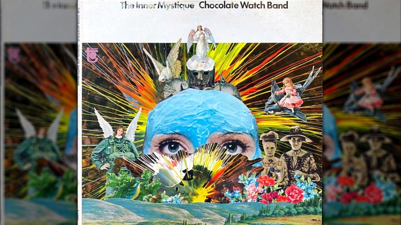
It only takes one look at the Chocolate Watchband's "The Inner Mystique" from 1968 to know why it's included here. We've got what looks like a giant lady's head wearing a blue papier-mâché skullcap bordered by some Victorian ladies on the right, an army dude on the left with an angel's head and wings, a sunburst rising from behind, more angels in the sky with pigeons, some blossoming flowers in front of the Victorian ladies, and, uh ... well, some other stuff we're not sure about.
We're not sure if the Chocolate Watchband knew what the cover for "The Inner Mystique" meant, either. Same goes for its artist, Bill Dhalle. It's easily the most abstract, weird, and perhaps arbitrarily-designed cover he worked on, and might be kinda-sorta loosely connected to ideas of enlightenment and inner visions. The songs on "The Inner Mystique" sound psychedelically-tinged, though the album's lyrics definitely aren't. As the story goes, the Chocolate Watchband was plagued from day one by band turmoil and the meddling of their producer, Ed Cobb, as guitarist Mark Loomis told It's Psychedelic Baby! Magazine in 2012. The band's initial run died the next year in 1969 with their third album. The artwork for "The Inner Mystique," however, still outstrips the trippiness of plenty of other covers.
Odessey And Oracle — The Zombies
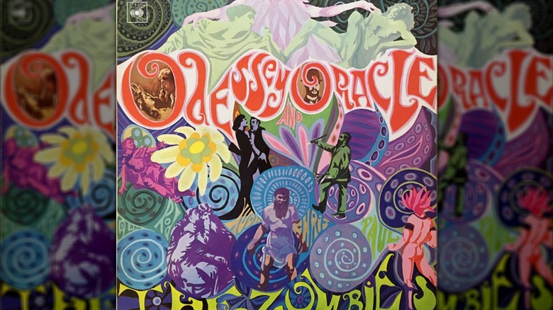
The Zombies' 1968 "Odessey and Oracle" is full of popping colors and color contrasts, beautiful hues of lavender, violet, and plum, human figures across time and culture composed of light/dark contrasts, plant life and marine life visual allusions, letters that flow along with the artwork, and so forth. It's just as cute and warm as it is psychedelic — two things that don't often go hand-in-hand.
Full credit for the cover goes to the aptly named Terry Quirk. Rather than a hired-gun artist, Quirk was a friend of the band. He was sitting with the Zombies, pencil and paper in hand, talking about the album that would become "Odessey and Oracle." The design just sort of came to him as they talked and he sketched it out, starting with the album title's wavy letters. It's Quirk who's responsible for the misspelled title — and it was a misspelling, not an intentional usage of the word "ode." But, because Odyssey is legitimately tricky to spell, no one caught the typo before the album cover went to press and "Odessey" became a part of the album's mythos.
Mythos might be overstating things, though. "Odessey and Oracle" is just as light as approachable as its cover, more like a collection of psychedelically-leaning, midtempo pop songs that skew Beach Boys more than anything. The Zombies called it quits following the album's release, but over the decades, the band came to new acclaim and even toured a bit, and Quirk's stupendous album cover remains.
Acheron — King Buffalo
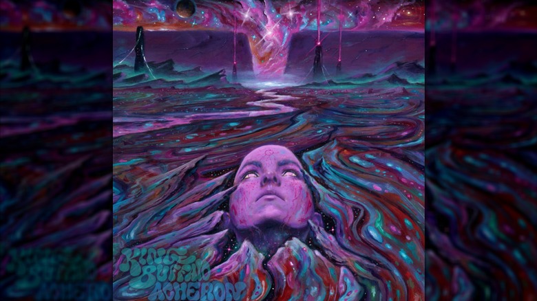
More than one King Buffalo album cover will twist your brain into oblivion ("The Burden Of Restlessness," we're looking at you), but we've got to give our nod to 2021's "Acheron." It's set in what looks like a purple-streaked alien landscape riven with swirls of red, green, and a river that flows to a starry cyclone along the horizon. In the center-bottom, a woman's face presses up from the ground and stares, upside down, at the cyclone, while pylons in the distance shoot purple beams into cosmic dust clouds.
The nifty thing about this album cover is that it was hand-painted in acrylic on a 12-inch by 24-inch panel, forever immortalizing the work of painter Ryan T. Hancock. You can see the entire cover, front and back, on Hancock's Instagram, to see how the front bleeds into an ocean of colored stardust on the back. Hancock is a freelance artist who's done album art for other bands (as his website shows), as well as for King Buffalo's "Dead Star" in 2020.
And just to highlight the psychedelic pedigree at hand, King Buffalo is a true, 21st-century standard-bearer of harder psychedelic rock. They've risen to prominence amongst modern stoner/psychedelic rock circles largely without a label. You can flip on their looping riffs, shrieking guitar lines, locked-in rhythm section, and meditative vocals while staring at their album covers — or any cover in this list — and feel yourself get drawn deeper and deeper into whatever world you see.
Polygondwanaland — King Gizzard and the Lizard Wizard
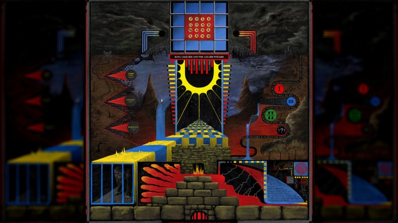
We could have filled this entire list with King Gizzard and the Wizard Lizard covers, but by our reckoning, 2017's "Polygondwanaland" sits at the apex of King Gizzard album cover trippiness. Rather than swirly and sinuous in design, it's geometrically mind-bending, full of right angles, foreground vs. background disparities, horizontal vs. vertical lines, and scattered, recognizable images that bring the abstraction into some semblance of cohesion: fire, mountains, running water, electric arcs, etc. It's basically a current-gen M.C. Escher painting. And most impressively of all, it invites prolonged attention and gets weirder the longer you look at it.
The cover for "Poly-G" (as its artist put it) comes from Jason Galea, who posted a time lapse of his work on Instagram from the initial black-and-white sketch to its final, full design. He says he did it all on his iPad. It's a wild accomplishment, especially given that his work on other King Gizzard covers are all vastly varied and equally bizarre in totally different ways (as we can see on his website).
And just in case you've never heard of King Gizzard: the band is the caviar of modern psychedelic rock — LSD-laced caviar bursting with genre-splitting flavors and infused with jazzy, proggy spices. Their reputation as relentlessly restless musicians speaks for itself, as does their music and Galea's perfectly complimentary covers. Take it at face value, here, and peer into the wrangled chaos of modern, rhymingly named psychedelic auteurs.