

5 Classic Rock Album Covers Every Gen Xer Can Instantly Picture

We may receive a commission on purchases made from links.
Never discount the power of a potent album cover. Covers can elevate an album as surely as they can diminish it, and the best of them can turn a classic into something absolutely unforgettable (Pink Floyd's "The Dark Side of the Moon" comes to mind). Every generation has crossed paths with such albums, including Gen X, who wound up with some real gems.
But before we dive into the most memorable of these album covers, we've got to clarify a couple things: 1) Our definition of classic rock, and, 2) What years Gen X covers. Strictly speaking, "classic rock" is an era of time, not a genre, centered on rock's "golden era" of 1964 through 1982, or about the Beatles through new wave. But, as we know the goalpost is always changing, sites like Masterclass now extend the definition to include bands through the early '90s, such as Nirvana and Pearl Jam. This is helpful for us, as Gen Xers were born anywhere from 1965 to 1980, making their coming-of-age music anything from Pink Floyd's "The Wall" to Nirvana's "Nevermind" (hint, hint for our choices).
Beyond locking down our range of release years, we're focusing on instantly recognizable, iconic albums covers — the kind you've only got to see once to remember, but have probably seen a kajillion times. Loads of albums qualify, but some really stand out. So let's pretend we're picking a vinyl off the shelf, or a cassette out of the box, and gaze at sights we could never forget.
The Wall (1979) — Pink Floyd
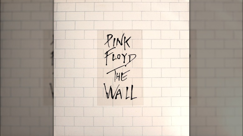
As if Pink Floyd needed another iconic album cover after "The Dark Side of the Moon," right? That's exactly what they produced with the exceedingly simple, but equally memorable and stark, "The Wall" (1979), which features a (drum roll) wall as the album cover. We're talking a white brick wall of one shade, with the band name and album title scrawled across it in thin, black lines. It's as though someone walked up to the blank wall with a bucket of ink and a paintbrush and slashed away.
The minimalist cover brilliantly represents what the album is all about, i.e., the struggle of Pink, the self-destructive, rise-to-fame character created for the album and 1982's "Pink Floyd: The Wall" movie. Like a wall between Pink and the outside world, the album cover represents Pink walling himself off from others emotionally, like a Roger Waters stand-in. Waters (Floyd's bassist and creative lead) was grappling with fame at the time and throttling Pink Floyd with an overly-controlling artistic vision. He used Pink, the character, to represent separating himself from the public. Waters even worked with artist Gerald Scarfe to make the album cover. Contrary to his controlling role within Floyd, Waters let Scarfe do his own thing with the cover. But, the whole wall of bricks was Water's idea, anyway.
It's funny, because the cover of "The Wall" is so exceedingly simple, it looks like anyone could do it. But its success is all in the details, down to the size of each individual brick. The final tableau no doubt contributed more than we realize to the success of the album, which generated Floyd's only No. 1 hit, "Another Brick in the Wall (Part II)."
Stop Making Sense (1984) — Talking Heads
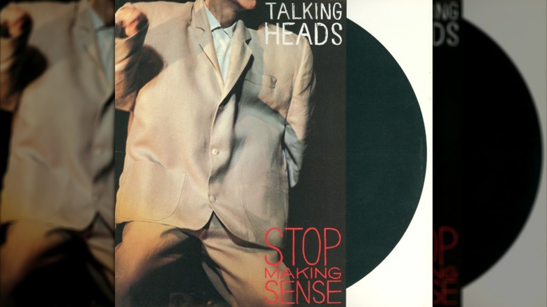
The Big Suit. What Gen Xer couldn't recall this album cover to mind on a dime? The cover is the perfect complement to Talking Heads' "Stop Making Sense" — one of the best live pop albums ever made — and its accompanying film of the same name from 1984. This album, film, and cover represent the absolute apex of Talking Heads' weird, art-rock, new wave-ish, post-punk, whatever-you-want-to-call it, career, encapsulated by David Byrne's Big Suit. Does the Big Suit make sense? No. But did you notice the album name?
Contrary to that name, "Stop Making Sense" has quite sensible origins. Director Jonathan Demme wanted to do a concert film, but without all the usual behind-the-scenes documentary-type stuff in other such films of the time. He wanted the performance, only. Demme recorded Talking Heads over four nights of concerts at Pantages Theatre in Hollywood in 1983, the year prior to the album and film's release. The result is a production where practically every shot is a hyper-memorable micro-moment. From Byrne's opening walk on the stage and solo acoustic guitar rendition of "Psycho Killer" (with boombox-played backing track), to his wobbly-armed dance on "Life During Wartime," plus the Big Suited "Girlfriend Is Better," every single performance makes the "Stop Making Sense" album cover all the more impossible to forget.
Born in the U.S.A. (1984) — Bruce Springsteen
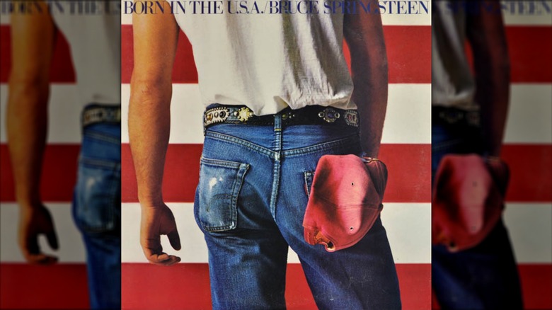
Yep, that's the Boss' butt on the cover of 1984's "Born in the U.S.A.," an album cover that easily ranks amongst the most memorable to anyone, not only Gen Xers. It's memorability isn't simply a matter of the butt shot, either, as way more albums than you might realize feature bulbous derrieres (especially from the '70s). It's the cover's entire composition, which contrasts the red and white horizontal lines of the American flag with the vertical lines of Springsteen's body, centered on the blue of his jeans — blue like the flag's field of stars, and blue like blue-collar. The cover is quite simply the perfect encapsulation of Springsteen's working-class, homespun Americana brand of rock.
That assessment isn't without its ironies, as the title track of "Born in the U.S.A." certainly isn't the patriotic anthem that lots of folks somehow still think it is; it's a scathing rebuke of the U.S.' treatment of veterans. Hence the album cover, which is meant not to mock the U.S., but to show Springsteen situated on the side of the working class, right down to the baseball cap sticking out of his back pocket. The basic elements of the cover were always there — flag, hat, jeans, etc. — but Springsteen and photographers Annie Leibovitz and Andrea Klein decided that the photo we got was simply the best one.
With such a memorable album cover on hand, "Born in the U.S.A." sold over 22 million copies and saw all seven of its singles breach the Top 10 on the Billboard Hot 100. Springsteen's career changed forever, along with the '80s and all of those Gen Xers who heard Springsteen again and again on the radio.
Appetite for Destruction (1987) — Guns N' Roses
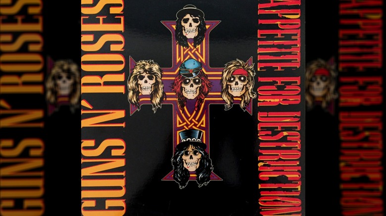
No debut has stormed across our collective musical landscape like Guns N' Roses' 1987 "Appetite for Destruction," which stands leagues above GNR's subsequent records. "Appetite for Destruction" is still the best-selling debut in music history, with over 24 million copies sold, five weeks at No. 1 on the Billboard 200 (and an absurd 261 total weeks on the chart), and monstrous hits like "Sweet Child O' Mine" and "Paradise City." The album did all this with a cover that was not its original sleeve art, but a censored version that's actually way more iconic than the original.
The original version of the "Appetite for Destruction" album cover looks like something out of a pulp sci-fi magazine. There's a red, multi-armed monster with swords for teeth leaping over a fence at a humanoid robot that's apparently murdered a woman who slumps against the fence on the ground. What in the world does this original Robert Williams-painted cover mean or have to do with any song on "Appetite for Destruction"? No clue and nothing, in that order. But, GNR singer Axl Rose wanted the cover, and Geffen Records rolled with it and then got backlash for it. They changed it to the one any Gen Xer can envision: the cross with the skeletal band member heads at the tips and center. Long Beach, California, artist Billy White Jr. sketched up the Rose-led design, complete with band and album name, and the rest is history.
The new version is much cleaner to look at, full of straight lines and easily remembered imagery. Heck, Slash's and Izzy Stradlin's skulls are even smoking, so you know this album is full of the kind of bad boy shenanigans that GNR became known for.
Nevermind (1991) — Nirvana
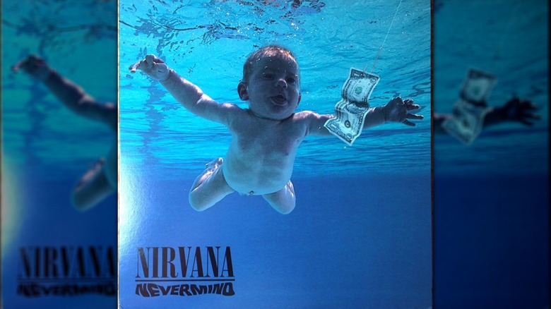
It'd only take a cursory mention of Nirvana's 1991 "Nevermind" to bring the album cover to mind, even for elder boomers who would have been in their mid-20s when it came out. The picture's blue saturation, the baby swimming toward a dollar bill speared on a fishing hook, the shimmering surface of the water overhead, and even the baby's wisps of hair and tongue sticking out: It's a stunningly accurate, if on-the-nose, portrait of the loss of innocence to the pursuit of wealth and fame.
Like many creative processes, such symbolism wasn't in mind from the get-go. Originally, as Milanote quotes designer Robert Fisher (an appropriate last name), Nirvana frontman Kurt Cobain wanted a picture of a baby being born in the water. Fisher couldn't find anything that worked, and Cobain suggested a baby underwater reaching out for something. He also suggested the fishhook. The two bounced around ideas about what to put on the hook, like a steak or a CD, before settling on a dollar bill. Then, Fisher called photographer Kirk Weddle, who reached out to parents for the photo shoot. After about 40 to 50 shots of several babies at various angles in the Rose Bowl Aquatic Center in Pasadena, Fisher found the one that we all know and love, right down to the perfectly outstretched arms and open eyes.
In 2025, this baby, Spencer Elden, lost a lawsuit claiming that the "Nevermind" cover was exploitative. Such happenings have done nothing to diminish the notoriety of the cover, however, which Rolling Stone ranked No. 10 on a list of 100 best album covers of all time. Oh, well, whatever, never mind.