

5 Album Covers That Made Vinyl Collecting An Art Form
After the joy that can be derived from the music proper, there might be no greater thrill in a vinyl collector's life than the possibility of amassing various 12-inch jackets into their own personal gallery. Album covers are their own vessel for artistry and expression — an extra dimension of creativity that can complement, emphasize, open up, or even fully subvert the words and ideas within the sound waves. And, in turn, curating one's stack of sleeves can also be an art form unto itself.
Whether by appreciating their summation of the record's vibe, decoding the hidden meaning behind them, or just marveling at the way they can fill up a room like a museum piece, good vinyl covers can be enjoyed in myriad ways. There's something almost ritualistic about the process of holding the recording package, opening it, taking in the gatefold, and devouring the liner notes, as though it were all a way to feel and see the music with your hands and eyes — to somehow grow more intimate with it, sink into it further.
The number of LPs throughout music history that have exemplified the spellbinding power of a good cover is about as massive as the variety of individual music tastes on Earth; any one person, if prompted to list the five covers that made them get into vinyl collecting, would probably come up with five completely different records. Even so, we've selected five masterworks of photography and design created for the likes of Grace Jones, Talking Heads, and Joni Mitchell, all of which stunningly translate the great music they encase while standing as show-stopping spectacles in their own right.
Maggot Brain — Funkadelic
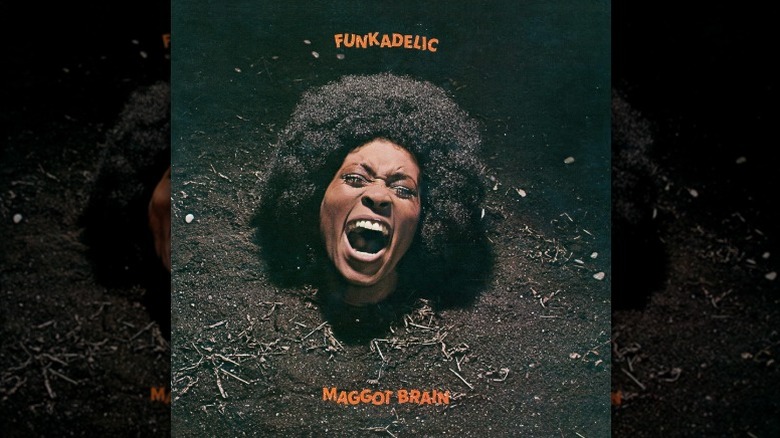
The irrepressible creativity of George Clinton gained its most pristine expression on "Maggot Brain," the 1971 magnum opus of his genre-bending collective Funkadelic. From its opening 10-minute Eddie Hazel guitar solo (spurred by an odd request from Clinton), it's a record that effortlessly splits the difference between the grungy viscerality of hard rock and the electrifying energy of funk — and this marriage is duly reflected on the album art.
"Maggot Brain" has one of those covers that immediately sear themselves into your mind: the head of a screaming woman, her face contorted into an expression somewhere between catharsis, laughter, rage, and panic, peeking out from a bed of soil. Captured by legendary music photographer Joel Brodsky, the woman in question is none other than Barbara Cheeseborough, the cover girl for the very first issue of Essence Magazine; it says something about the sheer iconicity of the "Maggot Brain" artwork that it arguably manages to edge out the Essence cover as Cheeseborough's most ubiquitous photo.
Outfitted with liner notes quoted from the Process Church of the Final Judgment and a back cover depicting a human skull where the screaming woman's head used to be, the packaging sums up the particular edge of Funkadelic, a funk band of ecstatic, gospel-inflected jams that could nonetheless dabble in sonic crunch, dark lyrics, and morbid imagery with the fluency of a heavy metal act. "Maggot Brain" is a paean to the galvanizing power of breaking rules and wallowing in madness, and the terrifying glee of Cheeseborough in the mud expresses that theme about as perfectly as any image could.
Hejira — Joni Mitchell
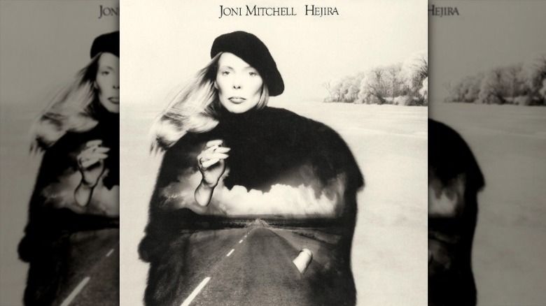
Between 1975 and 1976, Joni Mitchell hit the road. The Canadian singer-songwriter extraordinaire wrote most of her follow-up to "The Hissing of Summer Lawns" while traveling around the United States by car, largely on her own, resulting in songs that felt spacious, sprawling, and untethered. She then collated them into "Hejira," an album that reintroduced Mitchell as a dispenser of distal, bittersweet wisdom.
The album cover had to reflect this ineffable quality of Mitchell's new persona — at once ethereal and deeply grounded in the grime of everyday desolation. To pull it off, Mitchell, a painter by formation who had always designed her own album covers, embarked on a series of photoshoots themed around nature, travel, and escape — the first (by legendary rock photographer Joel Bernstein) on a frozen lake, the second in a hockey rink. Finally, she reunited with photographer Norman Seeff, with whom she'd done sessions for "Court and Spark" and "Summer Lawns."
It was Seeff who snapped the shot of Mitchell as an Ingmar Bergman-esque specter that would become the album's central image. They then selected 14 pictures from all three photoshoots and assembled them all into the final cover — not a collage, as it might seem, but a single in-camera shot made up of various masked layers. And so the world was graced with the "Hejira" album art, which presents Mitchell as a statuesque sage inviting us into a dark, cinematic road that she carries within herself. The sheer symbolic perfection of it made the sleeve a Mitchell must-have, as well as her own personal favorite out of her catalog.
Clube da Esquina — Milton Nascimento and Lô Borges
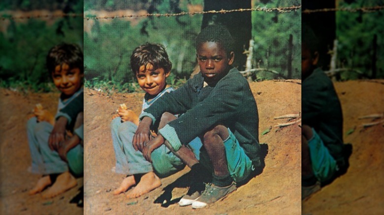
This legendary 1972 collaborative album between Brazilian MPB titans Milton Nascimento and Lô Borges is as shrouded in mystique as it is soft to the touch. Drawing virtuosically from a multitude of musical influences, "Clube da Esquina" (literally translated to "corner club") became one of Brazil's cultural calling cards on the world stage, yet its melodies and vocal harmonies are sweet and sincere enough to melt glaciers.
It's fitting, then, that the cover of "Clube da Esquina" features what may be at once the simplest and the most mysteriously evocative photo of two children ever taken. Contrary to popular belief, the boys on the cover are not Borges and Nascimento: The impromptu snapshot depicts "Tonho" and "Cacau," local kids who just happened to be sitting on a dirt road in Rio de Janeiro state while music photographer Carlos da Silva "Cafi" Assunção Filho was passing by in a car.
Nothing about it was planned or intended; Borges and Nascimento weren't even there when the photo was taken. Yet its elemental force — one kid holding a piece of bread and smiling, the other scowling suspiciously, both staring down the lens while sitting casually in that quintessentially Brazilian landscape — made it ideal for "Clube da Esquina." In 2012, Brazilian newspaper Estado de Minas traced the boys' identity to blue-collar workers José Antônio Rimes and Antônio Carlos Rosa de Oliveira, who unsuccessfully sued Nascimento, Borges, and EMI for damages. Contentious though the story's ending may have been, Tonho and Cacau became a defining image of MPB history.
Slave to the Rhythm — Grace Jones

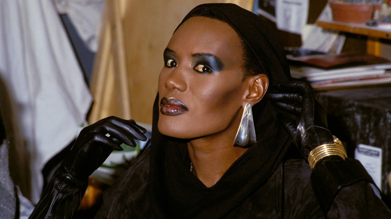
Grace Jones has the unique distinction in music history of being an enormously underrated icon. Remembered for her fashion, her mug, her psychedelic videos, and her acting roles, she also happens to be a musical genius, with an impeccable discography stretching across four or five different eras of pop music. The extent to which her visuals overshadow her musicianship in the public consciousness is, if anything, a product of just how flipping brilliant those visuals have all been: Not a single Grace Jones album cover is less than a 10/10, and the best, for 1985's "Slave to the Rhythm," is a straight-up masterpiece of the form.
Conceived by Jean-Paul Goude, the French graphic designer who was behind a lot of Jones' visual presentation in the '70s and '80s, the sleeve for "Slave to the Rhythm" rises to the challenge of summarizing the Jamaican multi-hyphenate's strangest, most experimental LP. The eight tracks on "Slave to the Rhythm" are all different versions of the same song, with Trevor Horn supplying varying shades of production to make each iteration its own journey, and the grand dame herself tying it all together with her imperial alto and arch sense of humor. Fittingly, the lithograph cover brings together several copies of the same Jones portrait into a wild, brash, utterly dazzling whole. If previous Jones covers positioned her as a straight-faced demigod allowing us mere mortals a glimpse of her countenance, the "Slave to the Rhythm" art showed that she could also be a goofball — and without losing an ounce of her superhuman magnetism.
Remain in Light — Talking Heads
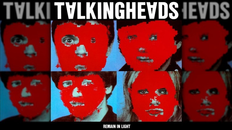
The original cover for "Remain in Light," Talking Heads' seminal 1980 album of paranoia-tinged dance rock, was to be a picture of airplanes. Tina Weymouth and Chris Frantz went into MIT with the idea to fiddle around on its room-sized computers, angling for something that matched the working title "Melody Attack." With help from tech researcher Walter Bender, they fashioned a collage of red Grumman Avenger bomber silhouettes flying in formation over the Himalayas — a nod to Weymouth's World War II veteran father Ralph Weymouth.
It might well have worked as a cover for "Melody Attack." But, when the album was retitled "Remain in Light," the plane montage got moved to the back sleeve. Luckily, Weymouth and Frantz's time at MIT had also produced a striking edit of the four simple portraits that were originally slated to make up the back cover. Influenced by Weymouth's fascination with masks and the album's proud African influences, the artwork of David Byrne's, Jerry Harrison's, Frantz's and Weymouth's faces covered in glitchy red blots was born, with a graphic design treatment by Tibor Kalman.
It was one of the first computer-designed album covers, and, right out the gate, it showcased the new tech's vast imaginative potential. Those pixelated red masks, as abrasively digital as they are uncannily reminiscent of exposed flesh and blood, instinctively get across the album's themes of alienation, depersonalization, and melting identity. Much like the music on "Remain in Light," it's a triumph of thorny philosophy made physically manifest — and, much like its hit single "Once in a Lifetime," it's somehow even cooler today.