The Hidden Meaning Behind These Album Covers
An album cover is almost as important as the music contained on the record or CD within. (Or, you know, the list of iTunes tracks next to a thumbnail image of that artwork.) A great piece of album art can tie an album together, give listeners something to cool to look at while they groove to the tunes, or provide clues about the inspirations behind the music ... or just be an obtuse series of nonsensical, random images. Here are some famous album covers in which there's far more than meets the eye, which is to say they actually do have a point.
Mumford and Sons - Babel (2012)
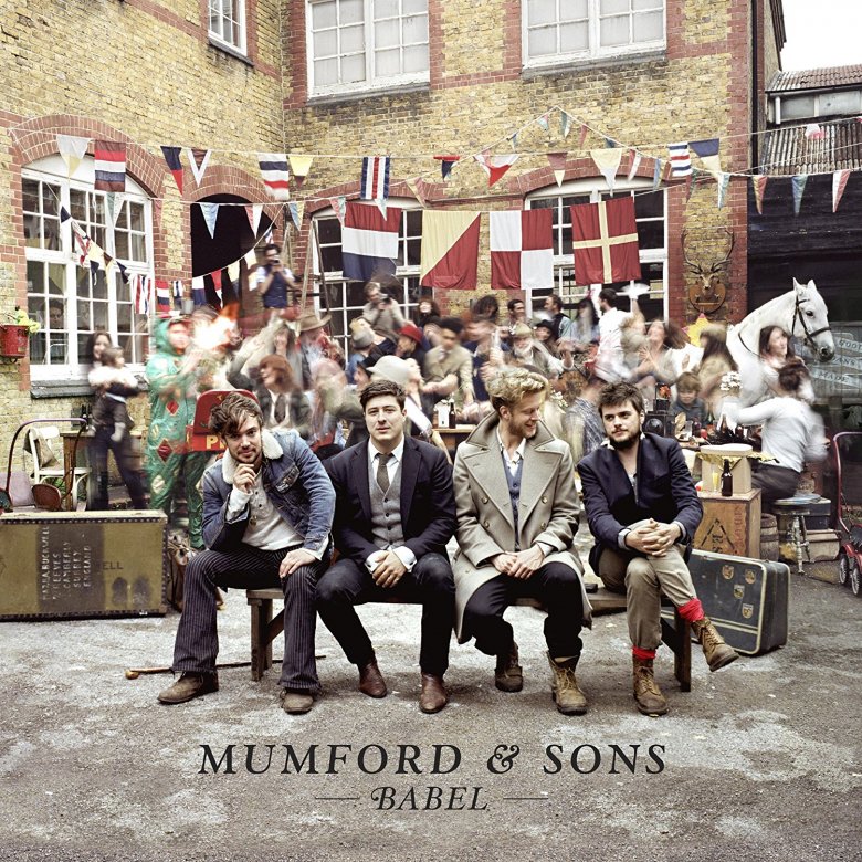
The most banjoing-est band on Earth broke through in a huge way with Babel, its second album of hard-charging, old-timey American folk music as performed by a bunch of English guys in vests. The cover of the record counteracts how seriously the band takes itself and its music, depicting the band sitting on a bench (some of them are even smiling!) while behind them, in front of a pub, there is much revelry, dancing, a guy in a crazy costume, and even a horse. They're partying so hard there's no way they're listening to Mumford & Sons, except they probably are because all those people are friends, relatives, or employees of Mumford & Sons. Band member Ted Dwane told Fuse that his girlfriend runs "an immersive theater company, and they came in and got everyone to go crazy. So everyone was being unnaturally fast in the background." So that explains the blurry look. But why such a chaotic image? Dwane said the band wanted the Babel cover to capture the spirit of their "Gentlemen of the Road" tour, particularly its "party vibes."
The White Stripes - Elephant (2003)
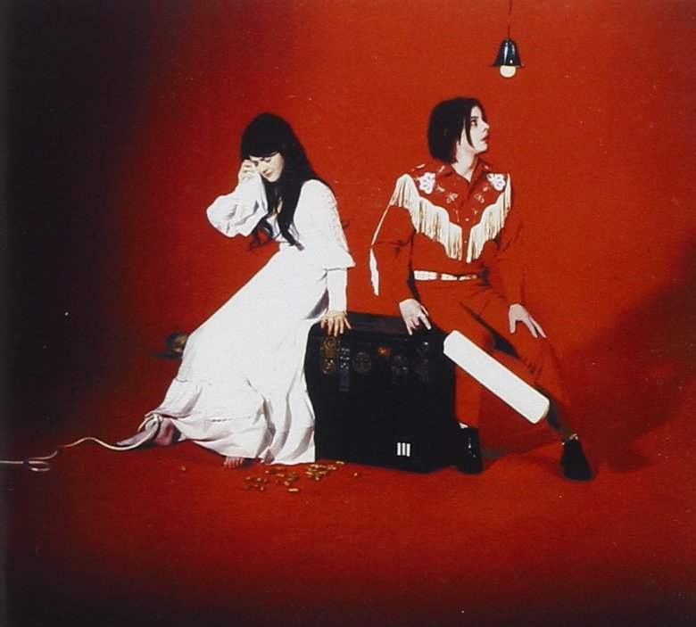
The "brother-sister" (actually ex-husband-wife) Detroit folk-punk duo released their fourth album, Elephant, in 2003, which boasted one banger after another, like "Seven Nation Army" and "The Hardest Button to Button." The sound that came out of just two musicians was huge, kind of like ... an elephant. Jack White says the grand beast appears on the jacket. In Jason Draper's A Brief History of Album Covers (via Diffuser), White claims, "If you study the picture carefully, Meg and I are elephant ears in a head-on elephant. But it's a side view an elephant, too, with the tusks leading off either side." OK, well, all that seems to be there are the Whites in their usual classic Nashville finery, along with an amplifier and a cricket bat. But if Jack White says there's an elephant on Elephant, there must be an elephant on Elephant. (To be fair, if you squint, you can see the rough shapes.)
Tool - 10,000 Days (2006)
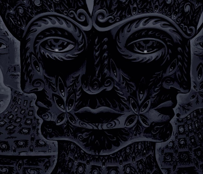
Tool has always catered to the discerning metalhead. Its music is complex, and its lyrics are inscrutable, as if Judas Priest went to grad school. It follows that the band's album covers are as cryptic and weird as its songs. The artwork of the band's 2006 album, 10,000 Days, depicts a creepy, somewhat ancient-looking face with deep eyes. Then a closer look reveals it's three faces; it's like one of those Magic Eye pictures but with more existential dread. The picture is part of a painting called Net of Being by psychedelic artist Alex Grey, who gets his inspiration from ingesting hallucinogenic substances such as LSD, mescaline, and ayahuasca. The cover of 10,000 Days doesn't mean much in particular, although Grey told The Examiner (via AlexGrey.com) that anytime somebody takes one of those drugs, "The visions that people encounter during these journeys are often deeply symbolic."
Rihanna - Anti (2016)
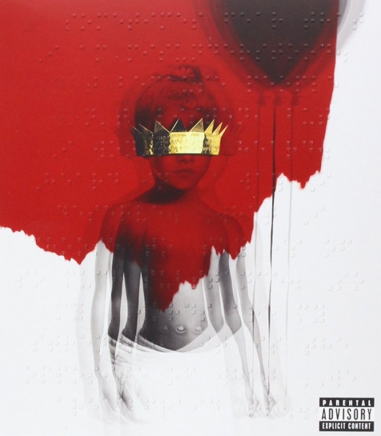
Over the past decade and change, Rihanna has evolved from a singer of throwaway dance singles into a complex and challenging musician. Her album covers have evolved, too. Gone are the glamorous, sexy shots adorning Good Girl Gone Bad and A Girl Like Me. In their place: provocative, thoughtful covers like ANTI. The 2016 album features an artfully out-of-focus image of a child, wearing a crown and holding a black balloon, against a white and blood-red background, along with some Braille messages. It's the work of an artist named Roy Nachum. "He sees things beyond the surface, which is why we even decided to collaborate," RiRi said at the album's cover launch party. (Yeah, the cover is so tight it got its own launch party.)
Nachum started with a real childhood snapshot of the singer, taken on her first day of daycare at age five. "The crown over the eyes is a symbol for the music," Nachum told Rolling Stone. "Here, I painted the young Rihanna bringing something new." The Braille message, for those who don't read Braille with their eyes, is from a poem called "If They Let Us" by Chloe Mitchell. An excerpt: "I sometimes fear that I am misunderstood. / It is simply because what I want to say, / what I need to say, won't be heard." As this is the album that includes some of Rihanna's boldest work ever, message received.
Coldplay - X&Y (2005)

Coldplay's third album offers up another round of that dreamy, sleepy, inoffensive music that's cool enough for the alternative rock station but lame enough for that "listen at work" station. And yet, the same old Coldplay isn't expected from the album's refreshingly weird cover: It's a blue background, and then some random, rainbow-colored blocks that looks like somebody made a cartoon appetizer out of Lego. Those colorful shapes are actually a graphical visualization of the Baudot code. That's an early telegraph communication system patented by French inventor Emile Baudot in 1874. Used concurrently with the more familiar Morse code, the Baudot system transmitted readable messages as ones and zeroes, assigned five-character sequences for every letter, number, and punctuation mark (e.g., B = 10011). On X&Y, the different colors and sizes of the blocks correspond to different bits and their letters, which spells out ... the album's title.
Kanye West - The College Dropout (2004)
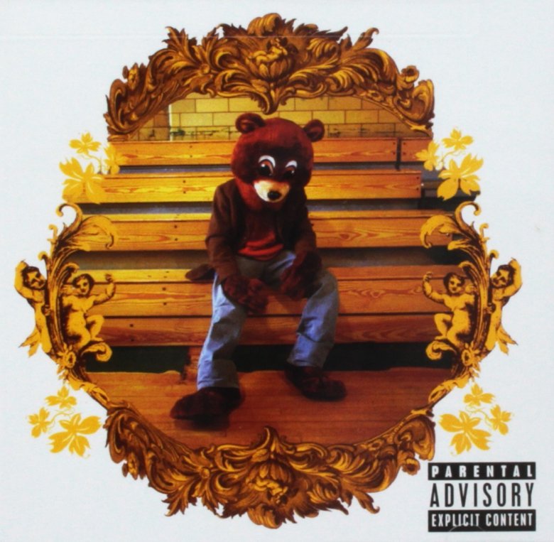
Not too many artists have a mascot. Sure, Iron Maiden featured its monstrous Eddie the Head on stage and on album jackets, and the '70s/'80s soft rock/country group Pure Prairie League put a cartoon cowboy on the front of all its records. And then there's Kanye West's "Dropout Bear," who first appears on the front of the rapper's game-changing 2004 debut The College Dropout, sitting forlornly on some gym bleachers. Plain Pat, West's manager at the time, confirms that it's Yeezy himself inside the bear suit, and also that the bear doesn't have any much meaning at all. "The bear just happened to be at the school where Def Jam had booked the photo shoot for the album," Plain Pat told Complex in 2014.
The Black Keys - Brothers (2010)
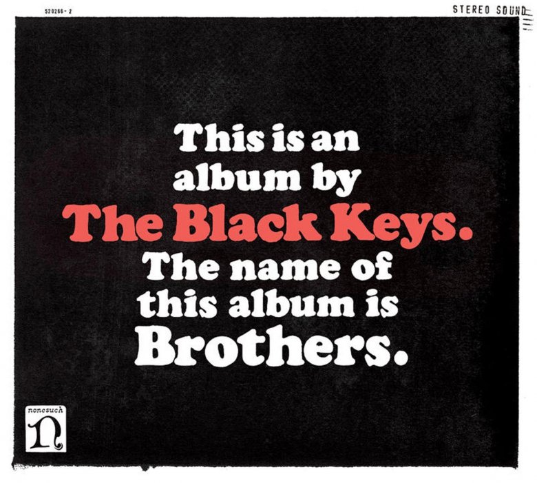
Sometimes, you can sell something just by saying it plain. Black Keys drummer Patrick Carney's brother Michael designed the cover of Brothers. Michael came up with the idea to just put words on a sleeve (meta, self-referencing words on a self-aware sleeve) when everyone decided to do something different from the standard album covers they'd done earlier. According to the New York Times, Michael suggested text that read, "This is an album by the Black Keys. The name of this album is Brothers" against a black background. He also thought the raw, simple cover reflected a similar sensibility in the band's bluesy, rootsy rock. But as the Black Keys' songs often recall music of the past, that cover is extremely evocative of the cover of blues legend Howlin' Wolf's 1969 LP The Howlin' Wolf Album. That one had black text on a white background (as opposed to the Black Keys' mostly white on black) and read, "This is Howlin' Wolf's new album. He doesn't like it. He didn't like his electric guitar at first either."
Arcade Fire - Neon Bible (2007)

The cover of Arcade Fire's second album is a static image — we're not into the era of Harry Potter-style moving images for covers quite yet — but upon a closer inspection, does it look like the pages of that open book made of light are in motion? Well, good, because that was the intent of cover artist Tracy Maurice, part of the same Montreal art community that spawned Arcade Fire. Once the band had decided on Neon Bible for a title, Maurice erected a 7-foot-tall book made out of neon — you know, like a neon bible. The band and Maurice planned to bring the piece on the road and hang it "as a backdrop at live shows, but it turned out it was too fragile to transport," Maurice told Billboard. For the cover, Maurice filmed the flickering sign with a 16 mm camera, then overlaid three separate frames to create that eerie image.
So what is a "neon bible"? Arcade Fire leader Win Butler took that from the novel of the same name, a lesser work by A Confederacy of Dunces author John Kennedy Toole. Butler told AV Club that while he's read the book, the name is a coincidence. "I just jotted it down in my notebook and kept coming back to it," he said.
Kendrick Lamar - To Pimp a Butterfly (2015)

No pimps, no butterflies, just two dozen or so mostly African-American men and boys of all ages celebrating in front of the White House. Photographer Denis Rouvre took the striking black-and-white photo of Lamar and a bunch of the rapper's family and friends, many of whom Kendrick Lamar told Mass Appeal he's known since elementary school. (Lamar is among them — he's the guy holding the baby.) Lamar's idea was taking those close to him "around the world and letting them see things that I've experienced," such as the White House, where he met with Barack Obama, the first American president to embrace hip-hop.
Not among the celebrants: a dead judge with his eyes literally X-ed out. The judge is there as a losing counterpoint to Lamar's family and friends, some of whom have criminal backgrounds. "You look at these individuals, you look at them as bad people, or a menace to society, but they're actually good people. Just a product of their environment," Lamar explained. "And the one person that hurts their life is a judge ... handing out football numbers of years and not giving these kids a chance at life."
Radiohead - Kid A (2000)
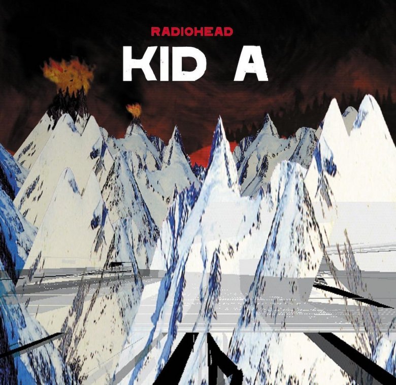
Radiohead's most experimental album to that point (since surpassed every time Radiohead releases an album) was its trippy masterpiece Kid A. Oddly, it's not the Radiohead album that included the song "Knives Out," because Kid A's dreamy, science-fictiony cover art was painted with knives (and sticks) instead of paintbrushes. "I got these huge canvases for what became Kid A, and I went mental using knives and sticks to paint with and having those photographed and then doing things to the photographs in Photoshop," designer Stanley Donwood explained to NME. The result was an image that Donwood says was intended to suggest "landscapes of power," specifically "some sort of cataclysmic power existing in landscape." Donwood was successful because "some sort of cataclysmic power" is a succinct and perfect explanation of Kid A.
Jay-Z - Magna Carta Holy Grail (2013)
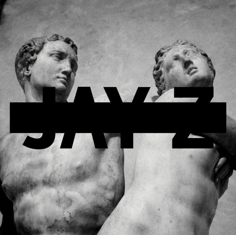
Hov's 12th album is one his few releases that doesn't feature his familiar face. Instead, it's got a black-and-white photo of a couple of statues from antiquity. The source of those sculptures remained a mystery for about a week, until the Metropolitan Museum of Art in New York cracked the case: It was one of theirs. The museum tweeted a side-by-side comparison of Magna Carta Holy Grail and the sculpture Alpheus and Arethusa. While it looks like it came from Ancient Greece (nude dudes, tight curls), it was created in the 16th century by Italian artist Battista di Domenico Lorenzi. Lorenzi drew on a Greek myth about the river god Alpheus' pursuit of a nymph named Arethusa, who tries to escape by transforming into a stream. Of course, he's a river god, and soon his water overtook hers. (Classic river god/nymph stuff.) Why Jay-Z picked this particular sculpture for an album jacket remains a mystery. But it is a piece (and story) about transformation, kind of like how Jay-Z elevated himself from drug dealer to wildly successful entrepreneur and entertainer. (Or maybe, like most pop culture made by Jay-Z or not made by Jay-Z, it's about Beyoncé.)
Dr. Dre - The Chronic (1992)
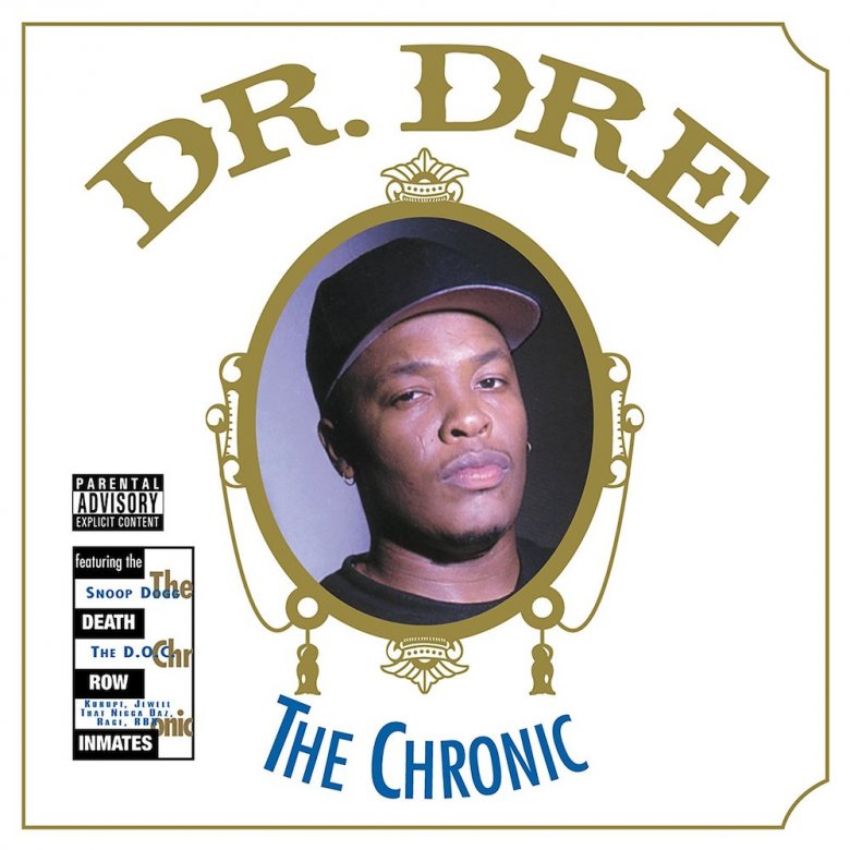
Fans of '90s West Coast rap, here's a truth bomb: Dr. Dre and his protégé and frequent collaborator Snoop Dogg are very big fans of marijuana. One clue to their enjoyment of the herb is the fact that Dr. Dre titled his first post-N.W.A. album The Chronic. That's a slang term for extremely strong marijuana. Another hint that Dre enjoys the sticky icky: the album's art suggests the packaging used on Zig-Zag rolling papers for decades. (Marijuana is encased into a rolling paper to create a cigarette-like thing called a "joint," you see.)
Joy Division - Unknown Pleasures (1979)
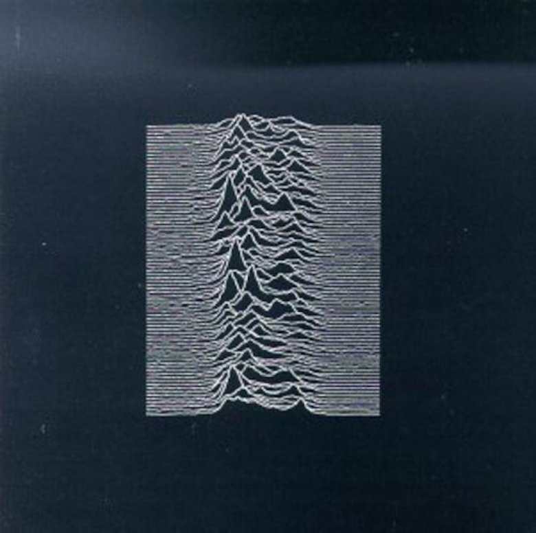
Joy Division's debut album is a goth-rock classic, but it wasn't an immediate success. It grew in status and influence over the years, certainly helped in part by countless cool people wearing T-shirts depicting the record's mysterious cover. It's a series of close-set squiggly lines that form mountain-like peaks in the middle. Cover designer Peter Saville explained in the short documentary Data Visualization Reinterpreted: The Story of Joy Division's Unknown Pleasures Album that the images came from the 1977 edition of the Cambridge Encyclopedia of Astronomy.
It's a visualization, or plot of data, of radio telescope readings picked up from a pulsar. Pulsars are incredibly dense, compressed, rotating stars, in which proton and electron currents moving inside create a magnetic field. The combination of rotation and magnetization form a radio beacon as the star travels through space. Each time the star spins around, a radio telescope captures that signal, which astronomers can then plot on a grid. The one used on Unknown Pleasures is a "map" of the first pulsar ever discovered.
New Order - Power, Corruption, and Lies (1983)
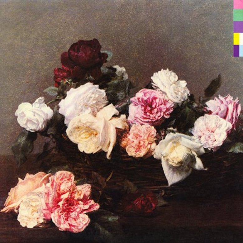
After the death of singer Ian Curtis, Joy Division necessarily evolved into New Order. The band brought along its favorite designer, Peter Saville, who designed the cover for many of its records, include Power, Corruption & Lies. When Saville heard the title, he later told The Guardian that he thought it sounded "Machiavellian," as in reflective of the dark and ruthless writings of 16th-century Italian political theorist Niccolò Machiavelli. His most famous work is The Prince, and so Saville headed to the National Portrait Gallery in London in search of a portrait of a "dark prince" to use as an album cover.
Does that seem a little on the nose? Saville agreed while at the museum, finding it "too obvious." He and his girlfriend exited through the gift shop, where Saville picked up a postcard of a painting of flowers by 19th-century French artist Henri Fantin-Latour. Saville's girlfriend told him that ought to be the cover. "It was a wonderful idea," Saville said. "Flowers suggested the means by which power, corruption, and lies infiltrate our lives. They're seductive." Heady stuff for an album of synth-pop.
Fleetwood Mac - Rumours (1977)
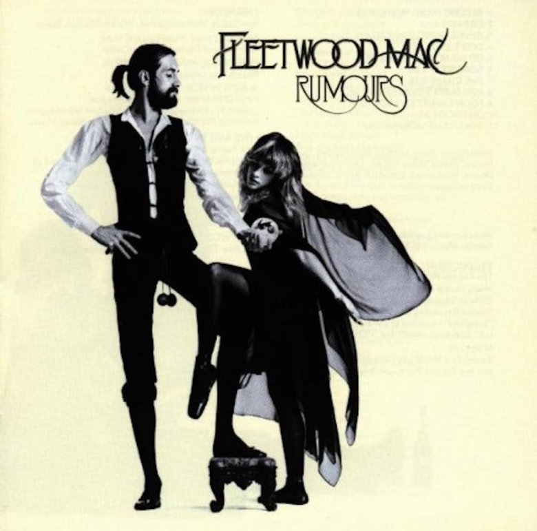
Sometimes, things that might seem important in a piece of art or an album cover really aren't that significant at all, but that alone can make them significant. Such is the case with the cover of Fleetwood Mac's monster hit Rumours, which members of the band recorded in between breaks from fighting with each other. Just two of the band's five musicians appear on the cover: singer Stevie Nicks and drummer Mick Fleetwood. While Stevie Nicks dances in witchy black clothing (as Stevie Nicks is wont to do), Fleetwood holds his bandmate's hand and stands grandly. Also, two little balls dangle in front of his crotch.
They're the kind one might find dangling from the flushing chain on an old-timey toilet — which is exactly where Fleetwood discovered them years earlier. In 2009 he told Maui Time that he was playing a gig one night and after "a couple of glasses of English ale," he used the facilities, saw the balls, and swiped them. Then he went out on stage with the tiny spheres "hanging down between my legs." Thereafter, they became something of a lucky charm ... until he lost them at a gig somewhere. (Happy ending: he hired a carpenter to make him a new pair of balls.)
Pink Floyd - Wish You Were Here (1975)
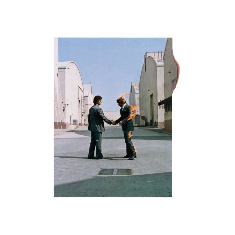
Aubrey Powell co-founded a design studio called Hipgnosis, which frequently worked with Pink Floyd, including its album Wish You Were Here. According to Powell's book Vinyl . Album . Cover . Art, (via Rolling Stone), the album's lyrics "were all about insincerity and absence" and how the recording industry is "a moveable beast that actually takes casualties with it" ... such as ex-Pink Floyd guitarist Syd Barrett, who officially left the band in 1968 because of mental health issues. (He's also the inspiration for the Wish You Were Here standout "Shine On You Crazy Diamond.") Hipgnosis's other chief creative, Storm Thorgerson, wanted to reflect that tone (prominent in songs about destructive and empty promises, like "Welcome to the Machine" and "Have a Cigar") and mock the music industry by literally depicting the then-common expression, "I've been burnt," i.e., "ripped off." He suggested two guys in suits shaking hands — the internationally recognized image of businessmen making a deal — but with one of them on fire. They hired a stunt man, and lit him on fire, and a photographer snapped the iconic image on the 15th shot. (Poor stunt man.)
Beastie Boys - Licensed to Ill (1986)
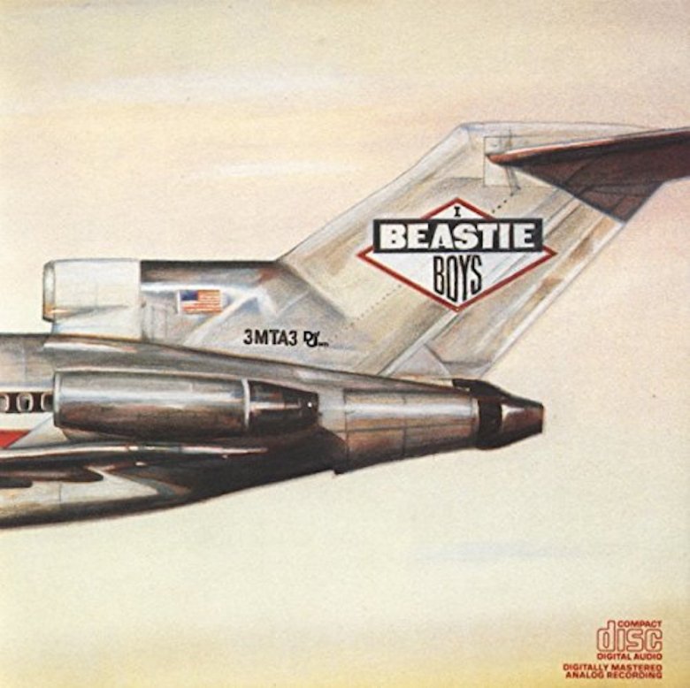
Back in the '80s, the Beastie Boys enjoyed an image as the rude, crude, party-crashing princes of hip-hop. But there was a dark, wry, even satiric sensibility hidden beneath the surface. For instance, the group's party-positive bro anthem "(You Gotta) Fight For Your Right (To Party)" was intended as a joke to make fun of songs like Brownsville Station/Motley Crüe's "Smokin' in the Boys Room" and Twisted Sister's "I Wanna Rock." That song appeared on Licensed to Ill, which has a cover laced with jokes and commentary.
In 100 Best Album Covers (via Diffuser), Beasties producer Rick Rubin said that while the album was being made, he read the salacious Led Zeppelin biography Hammer of the Gods. "In the book, there is a photograph of the Led Zeppelin private jet and the idea of this cover came from that," Rubin explained. "The Beastie Boys were just a bunch of little guys and I wanted us to have a Beastie Boys' jet. I wanted to embrace and somehow distinguish, in a sarcastic way, the larger-than-life rock 'n' roll lifestyle." That's why the cover shows a jet, and the fully extend gatefold shows the rest of the jet smashed into a mountain. But because the Beastie Boys worked on so many levels, there's another, more puerile joke hidden on the Licensed to Ill cover. The plane's serial number is "3MTA3." Held up to a mirror, it reads, "EAT ME."
Led Zeppelin - Houses of the Holy (1973)
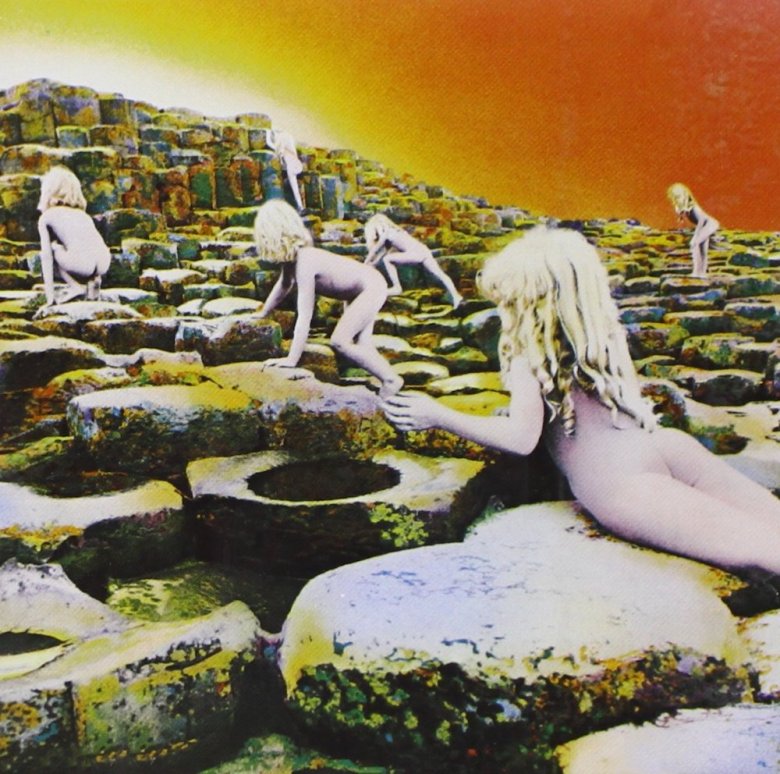
Hipgnosis did a lot of work for Pink Floyd, but that band wasn't the only beneficiary of its creepy-meets-pretentious aesthetic. The company produced the artwork for Argus, an album by the relatively obscure prog-rock band Wishbone Ash. Led Zeppelin guitarist Jimmy Page saw it, liked the vibe, and asked Hipgnosis co-founder Aubrey Powell to create the art for an upcoming album from his band. As he related in his book Vinyl . Album . Cover . Art (via Rolling Stone), Page didn't yet have a title and refused to describe the nature of the music or the lyrics. "Meet me in three weeks, and come up with some ideas. You know the kind of band we are," Page instructed.
One of the sketches Powell brought to the meeting was a visualization of the end of Arthur C. Clarke's sci-fi classic Childhood's End. "There was this image of all the children of the Earth rising up in this great firestorm and going up into outer space," Powell said. The drawing of kids rising upward strongly reminded Led Zeppelin singer Robert Plant of the imposing basalt columns that make up a formation in Northern Ireland called Giant's Causeway. A few weeks later, Powell organized a photo shoot on those rocks — which included, well, naked children, along with their parents, some chaperones, and makeup artists.
Santana - Abraxas (1970)
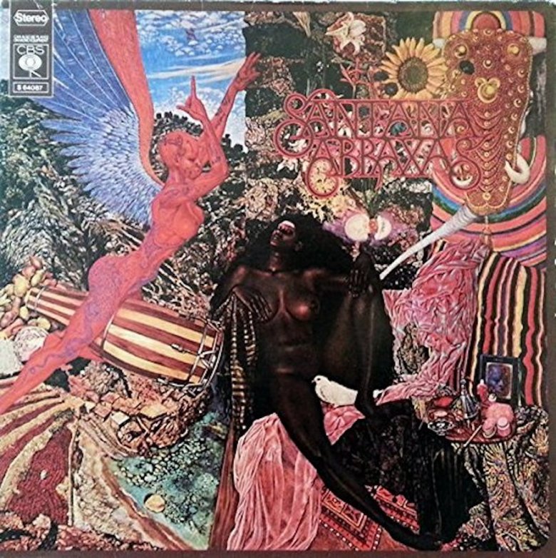
Except for slapping on the words "Santana" and "Abraxas" (the name of a deity in the Gnostic faith, also found in Herman Hesse's 1919 book Demian), the cover is a whole-cloth repurposing of an existing painting. It's called Annunciation, and it was made in 1961 by a German-born, Palestine-raised artist named Mati Klarwein. Created in the pastiche/collage style out of folk art and cultural iconography from around the world, the album's imagery has some deep spiritual meanings. In an In the Studio with Redbeard interview, front man Carlos Santana said the cover "signifies the annunciation of this angel Gabriel to Mary. Mary is the black lady at the center of the cover, and Gabriel is the angel with the congas between his legs." Now you know.
David Bowie - Blackstar (2016)
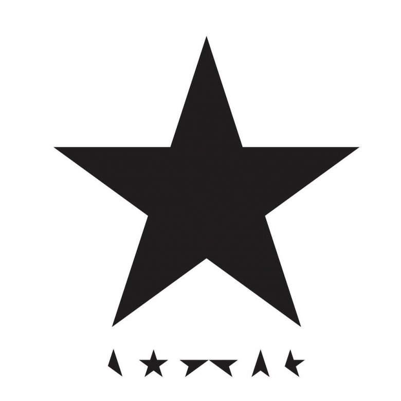
The too-good-for-this-world-anyway David Bowie died in January 2016, saddening and shocking anyone who ever cared about music. He'd just released his latest album, Blackstar, a couple days earlier to rave reviews. (Pitchfork gave it an 8.5 out of 10; NPR called it "feral, instinctive," and also "brutal and finessed.") The sad truth is that Bowie had been privately dealing with terminal cancer, and Blackstar was his intended swan song. The songs, and even the album's cover, are full of insights only the Goblin King/Ziggy Stardust/The Thin White Duke could provide.
One of those is the title and striking primary cover image: Blackstar and a black star, respectively. That's an alternate way to describe a black hole, a collapsed star that sucks in everything that comes near. It all makes for an apt and striking metaphor for human mortality, particularly when that mortality is the result of the unrelenting, life-sucking destructiveness of cancer. Jonathan Barnbrook designed five covers for Bowie, including Blackstar. "This was a man who was facing his own mortality," Barnbrook told Dezeen. The symbol of a black star on white "has a sort of finality, a darkness, a simplicity, which is a representation of the music." Barnbrook further explained that "the idea of mortality is in there, and of course the idea of a black hole sucking in everything, the Big Bang, the start of the universe, if there is an end to the universe." What have you been doing lately?