The Hidden Meaning Behind These NBA Logos
Basketball, like many other sports, tends to foster a devoted following. The intricacies of each team's roster as it changes from year to year, predictions surrounding draft picks, breakdowns of coaching strategies, memorization of player stats: fans' minds are as full of team data as the internet itself. Some, more aesthetic, aspects of basketball tend to get lost in shuffle, though. Such is the case with team logos.
Logos, as visual symbols, are supposed to encapsulate an idea or essence. Some logos are self-explanatory, such as the Toronto Raptors, whose current logo is simply a basketball being shredded by three talons, or the San Antonio Spurs, whose Texan-themed logo includes an actual spur for the letter U. Then there's the Phoenix Suns, whose revamped shooting star logo not only expands on the idea of Phoenix being as hot as the sun, and its team being hot stuff, but acknowledges that the sun itself is just one of many stars (ok, that might be a stretch, but work with me, here). Other, animal-themed logos reveal clear-cut meanings associated with the region the team comes from: the Milwaukee Bucks (looks like a deer), the Minnesota Timberwolves (looks like a wolf), and the Memphis Grizzlies (looks like a bear, but sorry, folks, there are no grizzlies in Tennessee, as stated on Mom.com).
Certain NBA logos contain hidden meanings, though, sometimes connected to older teams with obscure names (what's a Knickerbocker, anyway?) and histories.
A secret set of historical signs and symbols
Speaking of the Knicks, seriously: what's a knickerbocker? Well, if you've ever heard the word "knickers," that's a clue. Per NBA.com, Dutch settlers in New York commonly wore knickerbocker pants, and as soon as author Washington Irving popularized the name with his 1809 book A History of New York from the Beginning of the World to the End of the Dutch Dynasty under the humorous pseudonym Diedrich Knickerbocker, the word stuck. In the late 19th century it became en vogue in New York to cite Dutch ancestry, and the most common representation of such lineage was Father Knickerbocker, with a cotton wig, trifold hat, and yes, knickers. When the Knicks were founded in 1964 they adopted this historic emblem and gave him the Knick's iconic color scheme: blue, orange, and white.
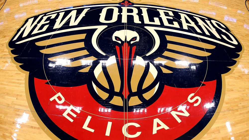
Other examples are less complicated, but interesting, nonetheless, as outlined on Stadium Talk. The Nugget's current logo, complete with a pickaxe and mountain, hearkens back to the Denver gold rush. The Los Angeles Clippers, upon being changed from the Buffalo Braves, decided on a name and logo to describe swift-moving wind moving though the sails of clipper ships that used to pass through San Diego Bay. The Celtics logo is basically an Irish stereotype pointing to Boston's connection with Irish-Americans, while the newly-minted Pelicans kept New Orlean's famed fleur de lis and adopted the region's pelican as symbol of determination, doggedness, and a hunter's instinct.

