The Hidden Meaning Behind These Movie Logos
Other than seemingly endless previews, the last thing you see right before a movie begins is the logos of the studios that made it. The average moviegoer takes these images for granted, but they've been given as much careful design as the films that follow them. (More, in some cases.) Many of these studio logos are steeped in lore. What is the hidden story behind some of Hollywood's most famous logos? Read on to find out.
Columbia Pictures
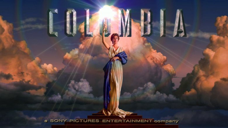
Founded in 1918 by siblings Harry and Jack Cohn and friend Joel Brandt as CBC Film Sales Corporation, Columbia Pictures is one of the oldest studios in Hollywood. In its early years, the studio mostly churned out low-budget fare, leading the Cohns and Brandt to re-brand themselves in 1924 as the more sophisticated-sounding Columbia Pictures. Their name and torch-bearing female logo refer to Lady Columbia, which is the mostly forgotten female symbol of the United States. Before there was Uncle Sam, there was Lady Columbia in her patriotic robes and armor, leading the way for America.
The studio has always used an image of a woman with a torch. The most recent iteration was designed by painter Michael Deas in 1992 during a massive reorganization of the studio. The original Lady Columbia was draped in an American flag, but Deas was told to change the color scheme to white, orange, and blue. (In a 2013 interview, Deas said he couldn't remember whether it was due to legal or trademark issues.) On the suggestion of a mutual friend, he asked Jenny Joseph, a graphic artist at The Times-Picayune of New Orleans, to be his model. The photo shoot lasted four hours, and Deas used the resulting images for his iconic painting. It's the only time Joseph has ever modeled, but millions of people have seen her face for the last 25 years every time they go to the movies. Not a bad torch to bear.
Pixar
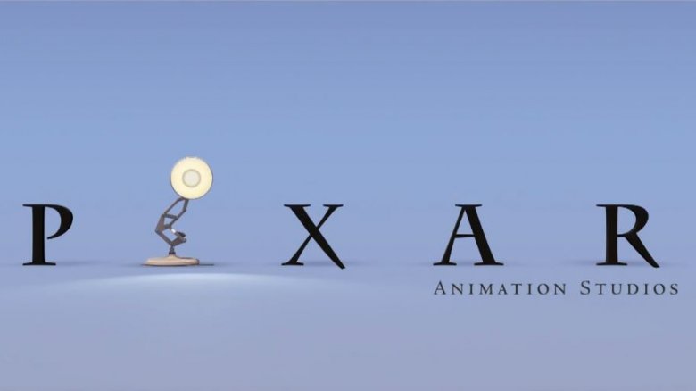
The acclaimed animation studio has been an innovative pioneer since its founding in 1986 when Apple impresario Steve Jobs purchased the Computer Division from George Lucas and rebranded it as Pixar. Current chief creative officer John Lasseter was with the studio from its earliest days with Lucas, and is responsible for many of its biggest creative achievements. But Lasseter is also responsible, in part, for helping create the studio's memorable logo.
Prior to the start of every Pixar film except Toy Story, a lamp is seen bouncing on the letter "I" until it deflates the letter. This image is a nod to the studio's groundbreaking, Academy Award-nominated first short film, Luxo Jr. from 1986. The two-minute comedic film features two desk lamps playing with an inflatable ball. Lasseter, who directed the film, designed the lamps based on the Norwegian-designed Luxo L-1 lamp he kept on his own desk. Luxo Jr. was a significant breakthrough for both the young studio and the industry itself, establishing Pixar as a leader in computer-generated animation, so when the company needed a mascot, the Luxo lamp was a natural choice. The logo premiered after the end credits for Toy Story, the studio's 1995 landmark film that skyrocketed the company to infinity and beyond.
Paramount
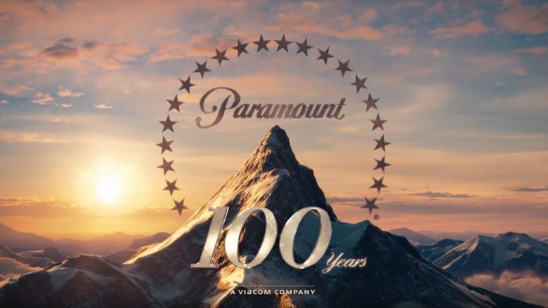
The oldest studio still headquartered in Hollywood and the second oldest film studio in the United States, Paramount is the result of a merger between several smaller studios. In 1912, Adolph Zucker founded Famous Players Film Company with the intent to produce feature-length films with leading stage actors of the day. A few years later in 1914, Jesse Lasky founded the Jesse L. Lasky Feature Play Company, teaming with future legendary director Cecil B. DeMille for The Squaw Man, the first feature film shot in Hollywood. Zukor, Lasky, DeMille, and Samuel Goldwyn joined forces in 1916 and merged with a growing distribution company founded by W.W. Hodkinson called Paramount Pictures to form Paramount Famous Lasky Corporation.
Legend has it that the mountainous logo came from a sketch Hodkinson drew himself. The Utah-based distributor often saw the Wasatch range and decided to use one of its peaks for his company's calling card. The stars were added later after Paramount's merger with Famous Players and Lasky Feature Play Company to represent the first 22 stars contracted by the company. The number of stars has gone up and down a little, but it's usually had 22 stars encircling the mountain peak. The logo has undergone a few subtle changes over the years, but the infamous mountain and stars largely remains the same. The current logo was created in 2012 to celebrate the studio's 100th anniversary.
MGM
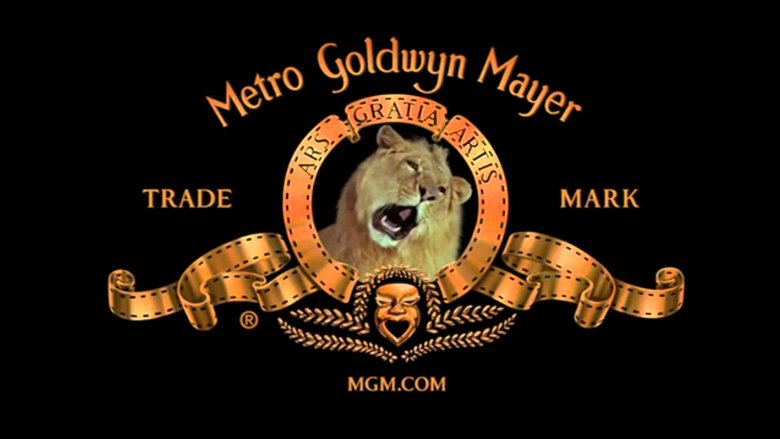
One of the most enduring and classic movie studio images, the roaring lion, belongs to Metro-Goldwyn-Mayer. The studio has used the same branding since its founding in 1924. Marcus Loew, founder of the Loews movie theater chain, acquired Metro Pictures in 1919 to ensure a steady supply of films to his theaters, but he quickly became unimpressed with the quality. In 1924, he merged Metro Pictures with also struggling Goldwyn Pictures and Louis B. Mayer Pictures to officially form Metro-Goldwyn-Mayer Studios.
The lion logo was already being used by Goldwyn Pictures prior to the merger with Metro and Mayer Pictures. The lion with banner reading "Ars gratia artis" ("art for art's sake") was designed by studio publicist Howard Dietz in 1916 as a nod to his alma mater, Columbia University, whose mascot is the lion. MGM kept the lion logo after the merger, though slight tweaks have been made over the years, including a rather unpopular "contemporary" logo in the 1960s used for just three films. The first time the lion roared was in 1928, and he's roared most years since then. The studio has used various lions, but "Leo" is the one the studio has been using since 1957. Leo's roar, however, is a mix of several different large jungle cats to enhance the sound. Essentially, you're watching a dead animal lip-sync every time you see an MGM movie. Ah, the magic of cinema.
TriStar Pictures
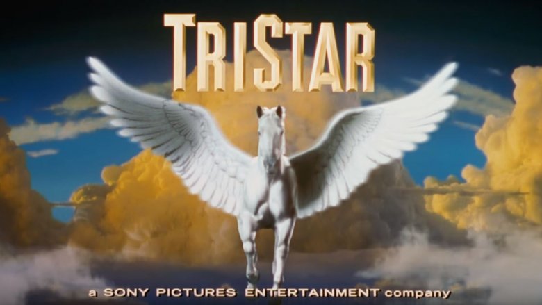
Conceived in 1982 as a joint venture between CBS, HBO, and Columbia Pictures to split rising filmmaking costs, TriStar pictures didn't have a name or logo until 1984. Founder Victor Kaufman and his family always loved horses, so he chose the pegasus as a symbol of the kinds of movies he hoped to make and to celebrate his love for the animal. Studio adviser and filmmaker Sydney Pollack "loaned" Kaufman the running horse image from his film, The Electric Horseman, for the first TriStar logo, transposing it from black to white. The logo was updated in 1992 for the studio's 10th anniversary, debuting before 1993's Sleepless in Seattle. The new logo featured CGI, painting, footage of clouds from Hawaii, and an updated pegasus image. The wings were created using real feathers and CGI, then added to footage of the horse that had been shot in a hangar at the Santa Monica airport. In 2015, TriStar's parent company, Sony, commissioned a VFX company to do an update to make the logo fully computer-generated and look better in HD formats.
Disney
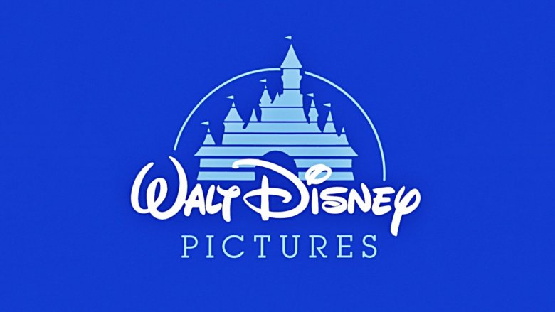
Other than Mickey Mouse, possibly no other symbol is more associated with Disney than castles. The company may be nicknamed the "Mouse House," but much of Disney's success is due to its animated adaptations of classic fairy tales, which helped financially bolster the studio especially after World War II. Castles are even a staple of Disney theme parks around the world.
It's a little strange, then, at least to anyone born in the 1980s or later, that the infamous Disney castle logo set to the tune of "When You Wish Upon a Star" didn't exist until 1985 when it first appeared before the much maligned The Black Cauldron. Prior to that, "Walt Disney presents" led off each film's opening credits. The new castle branding is likely the result of company shakeups when Michael Eisner took over as CEO in 1984 and sought to turn the studio around creatively and financially after a long slump following Walt Disney's death. In the early 1980s, the theme parks were generating the majority of the company's revenues, so it would have been a smart move to choose the image of a castle as a nod to the parks' success. Though the logo has changed through the years, the castle has become inextricably linked with Disney, warming the hearts of kids both young and old.
Legendary
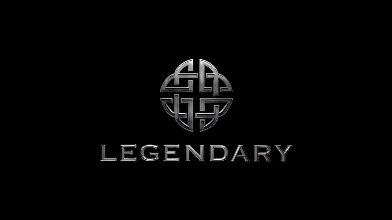
Founded in 2000 by billionaire businessman Thomas Tull, the relatively young studio has emerged as a major Hollywood player over the last 17 years. In 2005, Legendary made a deal with Warner Bros. to co-produce and finance films starting with Christopher Nolan's Batman Begins. The company struck a similar deal with Universal in 2014 and has made upward of $12 billion in box office grosses worldwide. Legendary's twisting logo is based on the ancient Celtic shield knot, which symbolizes protection, unity, and eternity because of its seemingly unending interlocking lines. Legendary is best known for epic films like 300, Clash of the Titans, Warcraft, and superhero fare like The Dark Knight trilogy, so its logo conjures images of heroic stories about ancient cultures or fantastical places. Unsurprisingly, Legendary is aiming to feel, well, legendary.
Bad Robot
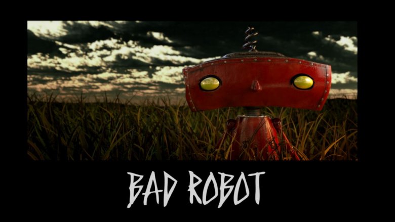
In just 20 years, J.J. Abrams has become one of Hollywood's most trusted and respected filmmakers, turning his once small production company into a serious industry powerhouse. Based in Santa Monica out of a building intentionally mislabeled "National Typewriter Co.," Bad Robot's logo was created in 2001 for Abrams' cult hit Alias on ABC. The logo features a red robot running through a field as voices yell, "Bad robot!" Abrams got the idea for the name during a writer's meeting, recording his young kids saying the line with his laptop. He told Entertainment Weekly, "I put together sound effects on my computer, burned a QuickTime movie on a CD, gave it to post-production, and three days later it was on national television." Bad Robot's little red robot is now almost as famous as the droids that appear in the new Star Wars trilogy the company has helped produce.
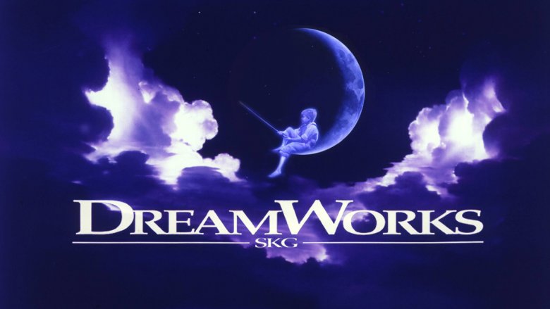
DreamWorks
In 1994, Hollywood moguls Steven Spielberg, Jeffrey Katzenberg, and David Geffen joined together to form DreamWorks, a new live-action and animation studio meant to rival major studios like Universal, Warner Bros., and Paramount. As such, Spielberg envisioned a logo that would reflect the Golden Age Hollywood feel the new company was hoping to evoke in its films. Spielberg came up with the image of a man fishing from the moon and commissioned painter Robert Hunt to render it. Hunt suggested the fisherman instead be a boy and modeled the image after his own son. The "SKG" text was added to recognize DreamWorks' three founders: Spielberg, Katzenberg, and Geffen. There have been slight variations over the years, including the current CGI version which features music from longtime Spielberg collaborator John Williams. However, the boy fishing from the moon remains a fixture of DreamWorks, unlike founders Katzenberg and Geffen. Geffen has effectively retired, and Katzenberg took over the animation wing as a separate company in 2004.