Here's Why The Golden Gate Bridge Is That Color
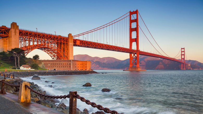
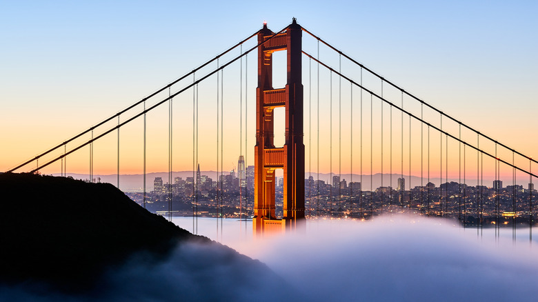
The Golden Gate Bridge is an architectural marvel made more magnificent by the shocking burnt red color it stretches across the San Francisco Bay. Manufactured by Sherwin Williams, the shade of paint is called International Orange (via KRON4). A few reports have claimed you can't buy this iconic paint color (via National Public Radio). While it's true that an off-the-shelf mix of that name isn't available, the Highway and Transportation District of the Golden Gate Bridge eventually released the formula due to incessant requests by the public (via Sherwin-Williams). If you want to give your walls the Golden Gate treatment, all you need is 69% magenta, 100% yellow, 6% black, and not even a smidge of cyan (via Santa Cruz Waves).
But how did this suspension bridge get its unique color? While the brilliant shade was discovered by accident, a dedicated staff of 28 painters, as well as engineers, ironworkers, electricians, laborers, and carpenters, are required to keep the bridge International Orange and not the color of rust (via KRON4).
International orange versus rust red
The story goes that when the painting crew finally reaches one end, they start all over again at the other. Paint superintendent Rocky Dellarocca in 2011 joked with a National Public Radio reporter that "yeah, you start at one end, and when you get to the other end, you retire." While the maintenance team of the Golden Gate Bridge is "continuously painting," said current superintendent Fred Mixon in an interview with KRON4, "it might not go one end to the other."
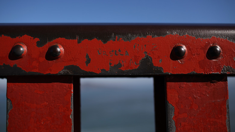
The constant maintenance is due to intense environmental factors. The bridge spans the Golden Gate Strait, which connects San Francisco Bay with the salty waters of the Pacific Ocean (via National Public Radio). Two auburns are continually pitted against one another: international orange versus rust red.
The salt-filled air is highly corrosive and causes extensive oxidation, the chemical process of rusting (via KRON4). Moist bay air weathers the bridge's steel, stripping electrons off the metal's iron atoms (via Sciencing). Add salt to the water and the chemistry catalyzes quickly. Salt water contains dissolved charged elements called ions. Their presence encourages the iron's electrons to be stripped away by oxygen atoms (via Sciencing). The rust flakes, and exposes fresh, unprimed steel ready for its own chemical degradation.
How to paint the Golden Gate Bridge
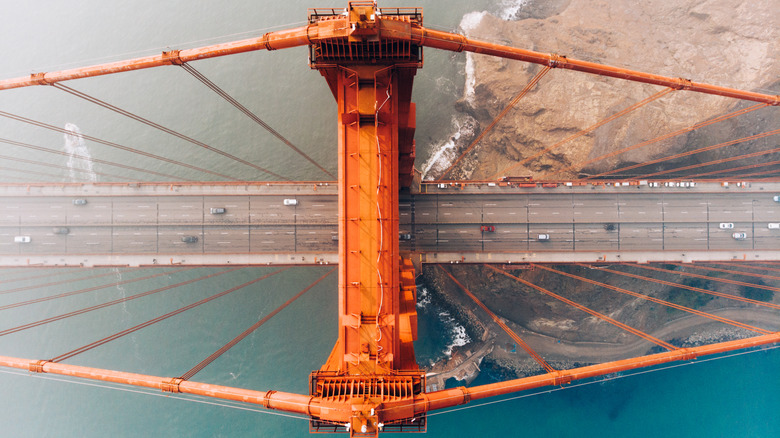
Near-constant maintenance is necessary to prevent the Golden Gate Bridge's facade from experiencing oxidative stress. The first step of maintenance is sandblasting to remove flaking paint and metal. After repairs, a primer is applied to the steel surface, then the rivets, bolts and trim are slathered with International Orange. Then, wider areas get their coats of color (via KRON4). Finally, the edges receive just a little extra paint to stem new peeling. These touch-ups require anywhere from 5,000 to 10,000 gallons of Sherwin-Williams red paint a year (via Santa Cruz Waves).
Few bridges are painted with such radical colors today, let alone in the 1930s (via National Public Radio). The emblematic orange shade is due to a paint manufacturer's default as well as the vision of Irving Morrow.
Morrow was a little-known architect who designed houses in San Francisco (via Public Broadcasting Service). As a local who commuted by ferry across the water from Oakland, he was intimately familiar with the blues and afternoon glow that bounced off the waters and hillsides of the city of San Francisco and its bay (via Public Broadcasting Service).
The bridge's color is discovered
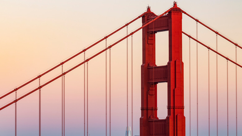
Construction of the bridge started in 1933 and Morrow was hired as a consulting architect (via National Public Radio). His task was to design aesthetic treatments, such as the pedestrian walkways, railings, and streetlights (via Public Broadcasting Service). His Art Deco elements are present to this day, including vertical fluting, chevrons, and beveling which all catch light and cast shadows (via Golden Gate Bridge Highway & Transportation District).
The bridge was slated to be slate. By default, the Golden Gate Bridge was, like thousands of other bridges across the country, to be a dull gray or black (via Public Broadcasting Service). If not that, the Navy showcased their practicality and architectural ineptitude with the suggestion that the structure should be painted in yellow and black stripes (via History). This would improve visibility for ships traveling in the bay's often foggy conditions. The idea was declined by the bridge's Transportation District (via National Public Radio).
One fateful day, tubs of industrial orange primer were opened and began to coat the bridge's steel (via National Public Radio). As Morrow witnessed a tower being treated with the functional paint, he was convinced the surrounding blue and hillside colors were complemented by this vermillion splash (via Santa Cruz Waves). This unique happenstance is how we got the color of the Golden Gate Bridge.
Architecture for the local geography
"He had to convince the Department of War, the permitting agency at the time, that the largest suspension span ever built at the time [should] have this wild, crazy color," explained Marie Curie, a spokeswoman for the Golden Gate Bridge during a National Public Radio interview. Luckily, it wasn't only Morrow who saw the potential. The primed sections of the bridge were visible for all to see and the community was elated with the shade (via Santa Cruz Waves).
Morrow submitted a report to the Board of Directors to have the final coat match the primer (via Santa Cruz Waves). The scenic strait needed the bridge's color to be just right. In his report Morrow explained that a "poorly chosen color may actually create disharmony between the structure and the site" (via Santa Cruz Waves).
Morrow wrote of the bridge with the same reverence he had for the surrounding geography. To him the bridge was "one of the greatest monuments of all time. Its unprecedented size and scale, along with its grace of form and independence of conception, all call for unique and unconventional treatment from every point of view," he explained poetically, displaying his passion for the project. "What has been thus played up in form should not be let down in color" (via National Public Radio). Also, there was no doubt that the orange was highly visible in fog, which might have kept the Navy at bay (via History).