The Controversial Legacy Of The Minnesota State Flag
As the United States entered the 21st century, many of its people sought to change the institutions within the country to correct the problems associated with systemic racism. The controversial monuments to the Confederacy have slowly begun to be taken down, some destroyed, and others put where some feel that they belong, in museums. Many of the statues and other tributes to men who enslaved people were erected and/or adopted during the Jim Crow era, as a tool to intimidate African Americans. In the decades that have since passed, the United States has seen slow but steady progress toward racial equality. "Separate but Equal" was nullified during the Brown vs. Board of Education Supreme Court decision. The Civil Rights Act of 1964 was passed. Poll taxes were banned with the passage of the 24th Amendment (via the Constitution Center). The barriers that kept racial equality from becoming a needed reality have eroded, but vestiges of them remain and show that there is still plenty of progress to be made.
Having an official reminder of servitude or racial injustice can make it difficult to believe that we're all on equal footing. To help change that, progressive-minded people have successfully changed much of the imagery that glorifies the wrongs of the past. State flags have been one of the targets, especially those with visual ties to the Confederacy. Georgia took the Confederate battle flag off of their state flag in 2004 (per New Georgia Encyclopedia). Mississippi followed suit in 2020 (via CNN). One northern state is currently embroiled in a flag-change debate, but it has nothing to do with any ties to the Confederacy.
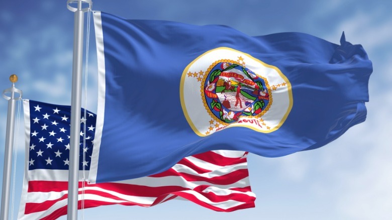
The Minnesota flag is being considered for a redesign

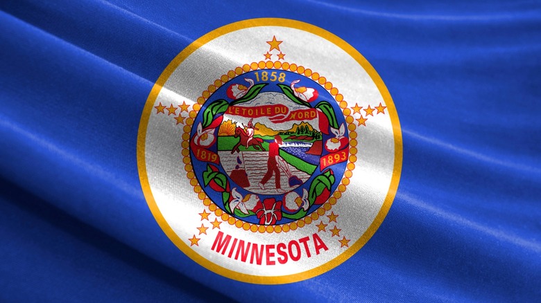
Perhaps the Minnesota state flag doesn't look like something that would be controversial at first glance. In the center of a blue field, the state emblem is framed by a border of yellow circles and five clusters of four stars set equally apart. The state name is written out in red bold letters at the bottom of the emblem, in between two of the star clusters. Nothing controversial so far, right?
Within the yellow circles, the emblem itself shows a farmer's field on the left, next to a body of water on the right (via the Associated Press). A farmer appears to be working the rows with a plow, his gun, and an ax set on a tree stump to his left. The farmer seems to be looking upward at a person in the distance that's riding a horse at the edge of the field. The rider looks distinctly like how some might depict a Native American. Atop a black horse, the shirtless rider is donning a headdress and carrying a long spear in the left hand. Above the rider are the words "Letoile du Nord," a French phrase that translates to "The Star of the North" (via the Minnesota Secretary of State). This has served as the official state motto since 1861. CBS reports that earlier in 2023, the state legislature was considering using a 16-member commission to redesign the flag and present it to the elected body. The reasons for this proposal range from potentially offensive imagery of the current flag to its failure to pass good design standards.
Proponents of changing the flag have varied reasons
Minnesota's DFL Rep. Mike Freiberg sponsored the bill calling for the creation of the flag redesign commission (via CBS). The assemblyman points out that many feel that the image of the Native American on the flag has undertones of racism and should prompt a new flag. "It has a very clear connotation. I just don't think it's a fair representation of Minnesota history, the diagram that's on the seal. It wasn't designed with input from the people it depicts on it, and I think that's a real problem."
But it's not just the racist imagery that concerns some proponents of a new state flag. The design itself leaves a lot to be desired. One retail merchant that sells the flag told CBS that no one ever looks at the Minnesota flag with any level of enthusiasm.
The North American Vexillological Association, which studies flags and flag designs, might provide a good reason why many do not care for the design. For a flag to be appealing, they maintain that it needs to be less visually complicated. This means no words, fewer colors, and a simpler design. Meaningful symbols can go a long way to creating a likable visual aesthetic that an array of colors and words cannot.
According to the Minnesota Legislature, as of February 23, 2023, the motion to change the flag was moving through the legal channels and a new design, if approved by the State Emblems Redesign Commission, would replace the current one on May 11, 2024.