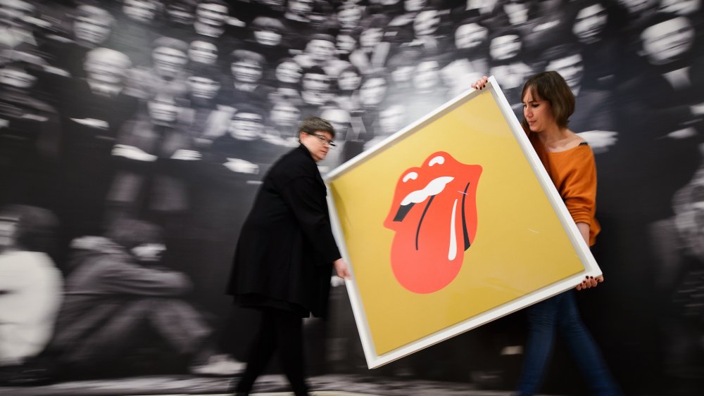
The Untold Truth Of The Rolling Stones' 'Tongue And Lip' Logo
Like the old saying goes, "if you want something done right, pay a college student £50 to do it for you."
In any case, that's how we got the Rolling Stones logo, that omnipresent icon of tee shirt sales and rock and roll, calling out from across the decades and unfailingly evoking a mental image of the word "moist." It's been fifty years since the design first hit paper, and plenty of theories have been thrown around as to its true nature. Theories involving such taboo topics as subliminal messaging, sensuality, and Andy Warhol.
In truth, the image came from that most noble of artistic intentions: wanting something "like the Shell Petroleum logo." At least that's what the design's creator, John Pasch, remembers being instructed to create. He was an art student in his final year at the Royal College of Art in London when he was approached by the Rolling Stones' head office and asked to create a poster for their upcoming tour.
Chef's open mouth kiss
According to the New York Times, Pasch's first shot at the design was turned down immediately. Still, "if at first you don't succeed, try one more time and nail it," and Pasch's second draft was a hit with the band. Not long after that, he was contacted again and asked "to create a logo or symbol which may be used on note paper, as a programme cover and as a cover for the press book."
The tongue and lips logo was born. The Stones apparently liked it so much that, according to Feel Numb, they paid Pasch a bonus of £200 on top of his £50 fee, which is a fortune in art student money.
As for the meaning behind the design, Pasch has given a number of explanations over the years. Rolling Stone quoted the artist as saying it was meant "to represent the band's anti-authoritarian attitude, Mick's mouth and the obvious sexual connotations," although he has since stated that the Jagger imagery was sunconscious on his part. More than anything, it was meant to do exactly what it's done: look good on merchandise.

