Why Greenland Is Way Smaller Than It Appears On Most Maps
If you've ever looked at a world map — and we'll assume that you have — you've probably been struck by just how massive Greenland is. (Greenland is that island to the northeast of Canada. No, not Iceland, the bigger one.) On most maps, Greenland appears to be one of the largest landmasses in the world. It looks far bigger than countries like the United States and Australia, and is only comparable in size to the entire continent of Africa. It's no wonder Donald Trump wanted to buy Greenland back in 2019; imagine how huge the United States could've become!
But, in reality, Greenland is nowhere near as big as most maps would have you believe. Neither is Antarctica, for that matter, nor Northern Europe, nor anything to the far north and far south of a map. Why? Because maps lie to you. As you (hopefully) know, the Earth is a globe. Most maps, on the other hand, are flat rectangles. Turning a spherical surface into a rectangle is a mathematical challenge, one that has plagued mapmakers for centuries. Unfortunately, there's no way to perform this geometric feat (called "projection") perfectly; any map will have a distortion of size, a distortion of shape, or some other error.
Even though we can never develop a perfect map, that hasn't stopped us from trying. The problem, however, is that most of the world's maps still use a projection system designed for sailors over 450 years ago.
The popular Mercator map projection distorts land size near the poles
Among the many map designs that have been developed over time, the most popular is the Mercator projection. According to National Geographic, this map style was designed by Gerardus Mercator, a 16th-century geographer born in Flanders (part of modern-day Belgium). When Mercator was born, the so-called "New World" had just been discovered, and an era of global exploration was underway. Mercator wanted to develop a map of the entire Earth which could help sailors navigate effectively.
In 1569, Mercator released that map. It followed a new projection system that Mercator had personally designed. He essentially remodeled the Earth as a cylinder, then "unfurled" it with his map. With this projection, all of the globe's latitude and longitude lines are shown intersecting at perfect 90 degree angles. This isn't accurate, but it helps navigators plan straight courses to their destinations.
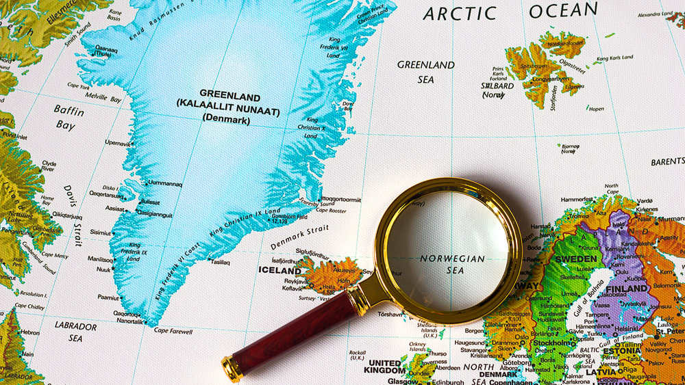
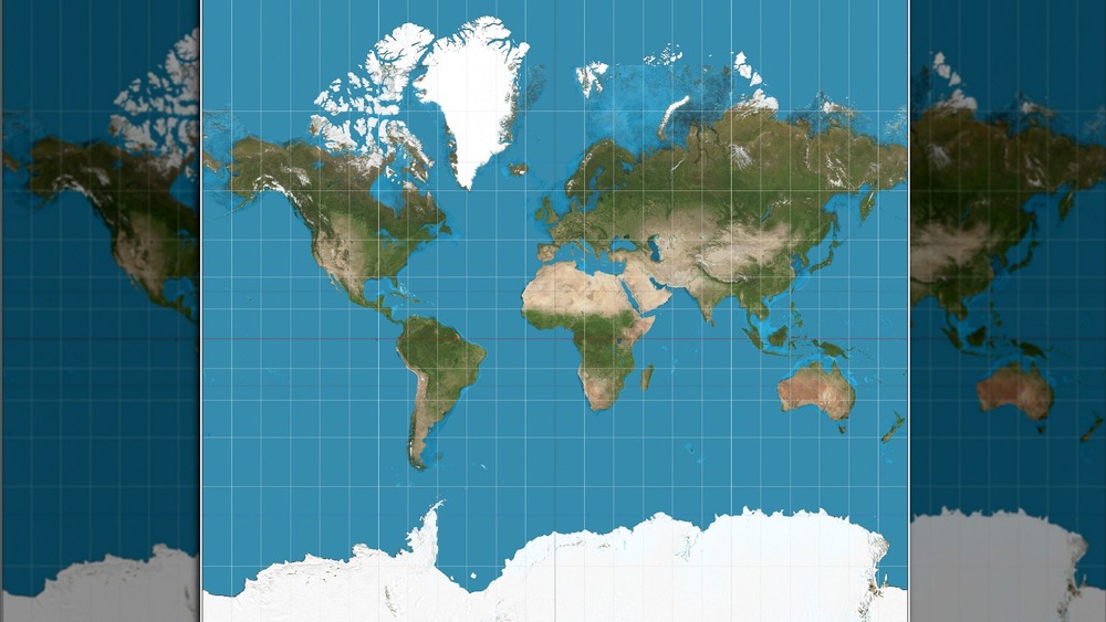
While effective for navigation, there were some major flaws with Mercator's map. It did a decent job showing the right shape of the world's land masses, but horribly distorted their sizes. Under Mercator's system, everything close to Earth's equator is depicted small and compact, while land masses near the poles are shown way larger than they are in reality. This is most obvious in the way that Greenland (in the north) and Antarctica (in the south) appear gigantic. Unfortunately, Mercator's map was so useful for navigation that it became the international standard, even into the modern era.
In reality, Greenland is only 1/14th the size of Africa
Today, if you look for a map online or find one hanging on the wall of a classroom, there's a good chance that it's a Mercator projection. (Yes, that includes Google Maps.) Since we see the Mercator so much, many of us have a distorted idea about how the world actually looks. Very distorted, in fact.
With Mercator's system, Greenland appears to be roughly the same size as Africa. In reality, per Mental Floss, Africa is 14 times larger than Greenland. Likewise, Mercator maps often depict Antarctica as a hulking blob of land, far bigger than any other continent. But, per NASA, Antarctica is only as big as the United States and Mexico combined.
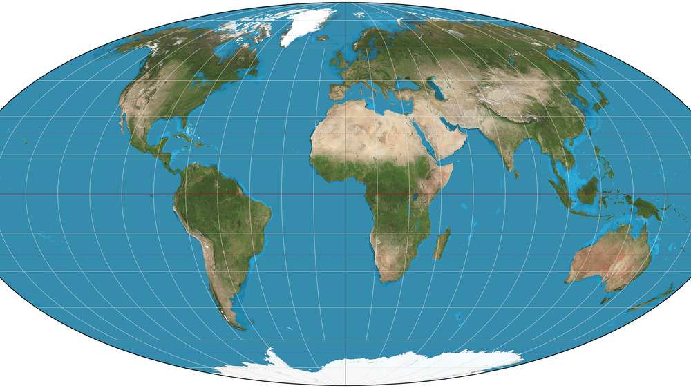
In recent years, many have called for the Mercator to be retired. Not only is it inaccurate, but some argue that it's also racist; it greatly exaggerates the size of Europe while minimizing continents like Africa and South America. (Per World Atlas, Africa is almost three times the size of Europe.) That said, no replacement for the Mercator is perfect. While some, like the Gall-Peters projection, get landmasses' sizes right, they get their shapes very wrong, per Business Insider. Others have experimented with non-rectangular maps, like the Mollweide projection shown above; these are typically more accurate, but come with their own weaknesses. As a result, if you want to understand how the world really looks, you may just have to consult a globe.