Most Offensive Sports Logos Of All Time
intro
What's the formula to create a great sports franchise? Talented, yet sometimes overpaid athletes, a welcoming stadium with cold, yet always overpriced beer, diehard fans who are willing to sometimes wait over a century for a championship ring, and a logo that embodies the heart and soul of the team. Some teams have logos with a long and cherished history, while others have logos so controversial and offensive they're a hot-button issue discussed on cable news networks and in college classrooms nationwide.
Cleveland Indians
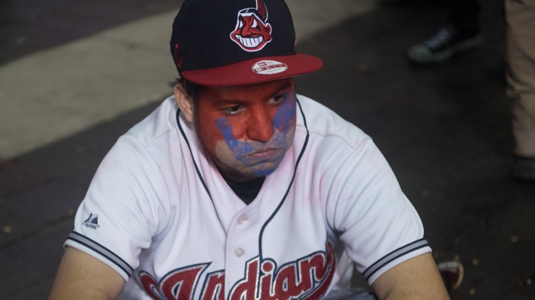
The Cleveland Indians have used a big-toothed, bright red-faced, Native American cartoon character named Chief Wahoo as their logo for over 70 seasons. Times have certainly changed since the 1940s — you're probably reading this while on the toilet holding a smartphone that has more technology packed in it than the computers that helped us land on the Moon, right? Yet folks in Cleveland are still rocking the controversial Native American caricature. It wasn't until 2013 that the baseball club removed it as the primary logo, but it's still a secondary logo.
Those in support of the logo claim that by getting rid of it would erase the history of the club and that the team's name and eventual Wahoo logo were created to honor Louis Sockalexis, a member of the Penobscot Nation and the first Native American to play professional baseball. But if you put a picture of Sockalexis next to Chief Wahoo there is no resemblance whatsoever, because Sockalexis was a person, and Chief Wahoo came from the mind of a white dude in the 1930s who worked at a Cleveland newspaper drawing cartoons dripping with stereotypes. Chief Wahoo has gone under many stylistic changes over the years, including changing his skin tone from burnt orange to a bright red and making his nose smaller, but plenty of people still think Chief Wahoo is among the most offensive team logos of all time.
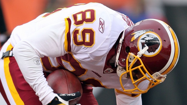
Washington Redskins
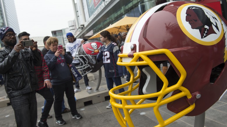
Why do people think the Washington Redskins logo and mascot are more offensive than, say, those of the Chicago Blackhawks? The team name is widely considered nothing more than a racial slur, a derogatory term for the skin tone of Native Americans, and the logo exaggerates that tone considerably. Just including the name in print is a no-no for several large publications and some sportscasters avoid using the word "Redskins" on-air altogether, referring to the team instead as just "Washington."
The current version of the logo was developed in 1971 with help from Walter "Blackie" Wetzel, a political leader in the Blackfeet Nation and a former President of the National Congress of American Indians. The team recruited Wetzel and and other Native American leaders to agree on a new logo. You know when someone says, "I can't be racist, my best friends are [insert minority here]"? That's basically what the front office of the Redskins did in the 1970s. The logo may have been created with help from tribal leaders, but that doesn't change how offensive people from a variety of backgrounds consider the nickname to be.
Notre Dame Fighting Irish
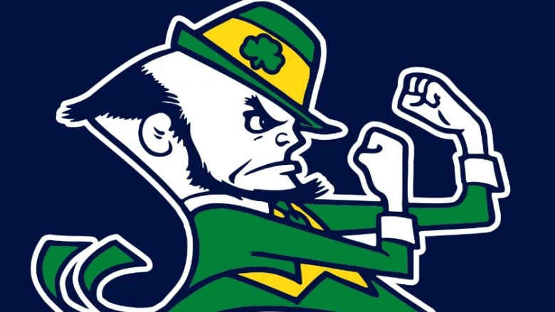
Notre Dame's Fighting Irish might not be as offensive as other logos on this list, because as far as we know, leprechauns are mythical creatures who haven't been spotted in more than a decade. But the name and logo conjures up stereotypes associated with Irish people, including the propensity for them to use their fists to settle disputes. According to Notre Dame, the university actually started out competing as "Catholics," and later the "Ramblers," and it was other schools who used the term "Fighting Irish" to describe them in a derogatory manner.
Notre Dame adopted the name in the 1920s, but it wasn't until the 1960s that they began to use the leprechaun engaging in fisticuffs as one of their logos and as a mascot. Before that, the university used a group of adorable, cuddly, and non-threatening Irish terriers to represent the team. That's a mascot we can all agree on. Who's a good mascot? Yes you are. Yes you are.
Coachella High School Fighting Arabs
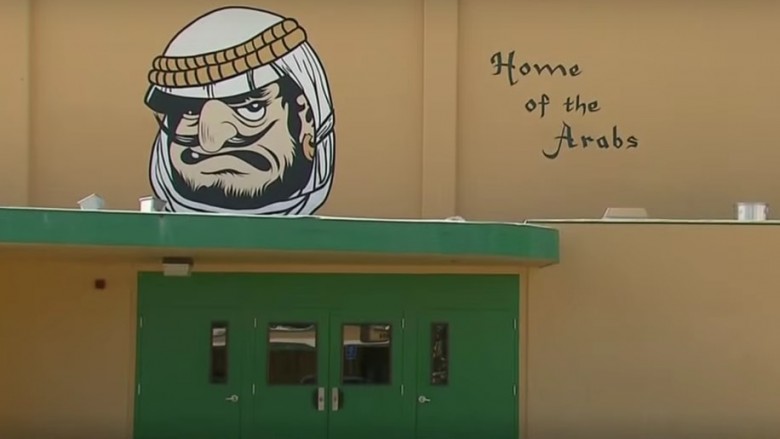
Not only is Coachella, California famous for a festival where celebrities and drunk twenty-somethings live in haze-filled harmony for a weekend, they're also known for one of their local high schools using a caricature of an Arab man for a logo and mascot. Coachella Valley High named their team the Arabs back in the 1920s to pay homage to the desert-like landscape and the fig and date production in the area. Their logo was always a man of Middle Eastern descent with a "snarling face, a hooked nose, a heavy beard and wearing a headscarf."
That is, until the logo was changed in 2014 with help from the American Arab Anti-Discrimination Committee. Coachella Valley High went from the Fighting Arabs to the Mighty Arabs and their logo was revamped to be more politically correct. Also — no joke — they eliminated the use of belly dancers at school events and games.
Atlanta Braves
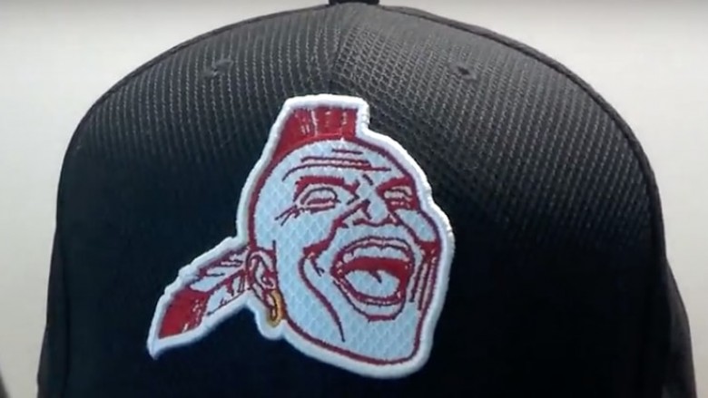
The Atlanta Braves have used their current logo, featuring the team name in a classic script font with a tomahawk underneath, for 27 seasons, but it's their former logo of a "screaming savage" named "Chief Noc-a-Homa" that earns a spot on this list.
Despite public outcry in recent years for teams to eliminate the use of Native Americans as mascots, back in 2012 someone's drunk uncle in the Braves organization thought, "You know what would be a great idea for new batting practice hats? Let's bring back that screaming Indian." The Braves ultimately ignored the proposed idea, yet somehow hats were still produced with the infamous logo. Despite the slip-up, the Braves continue to try and erase the iconography even on their throwback jerseys.
London Rippers
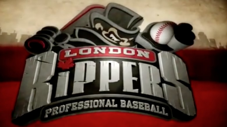
Because of the family-friendly nature of the sport, non-MLB baseball teams are known to have fun when naming their clubs. There's the El Paso Chihuahuas, for example, or the New Orleans Baby Cakes. But when London, Ontario, landed a club in the Frontier League, they thought that instead of naming their organization after a tiny dog that hangs out in a Coach purse, or a plastic toy stuffed in a cake that you can chip your tooth on, it would be a great idea to use an image of an infamous murderer and name the team after him.
The former owner of the short-lived club, the London Rippers, claimed that the name had nothing to do with the British serial killer from the 1800s, but rather it means to "rip a baseball down the field." What was the name of the menacing mascot? Oh, his name was Jack, but it was totally a different Jack. According to former team president David Martin, the Jack on their logo was "Diamond Jack, a frustrated hockey player who found he could 'rip' the cover off baseballs. Despite his talent, teams grew weary of the expense of replacing balls, so Diamond Jack decided to form his own team in London, Ontario."
Even the mayor of Ontario asked the team to change its name. They refused, however, and in a twist of fate, the team was killed off from the Frontier League after only one season.
Kansas City Chiefs
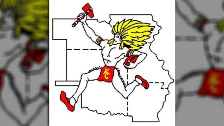
The first logo for the Kansas City Chiefs depicted an awkwardly positioned "Native American warrior" who looked a bit like a cross between He-Man and Lion-O wielding a tomahawk and wearing a loin cloth. The franchise only used this logo from 1963 to 1971 and have used their current logo since then. Although the logo they have used for 46 years isn't offensive per se, the Chiefs are yet another team who comes up in conversation about offensive, Native American-inspired names.
The Chiefs were named after former mayor H. Roe Bartle, a white guy who had the nickname "Chief," but the organization thought it would be easier to roll with the Native American imagery. Why they chose to keep the warrior in the logo as white as Casper is a mystery. Is it supposed to be a cosplaying Bartle?
Ole Miss Rebels
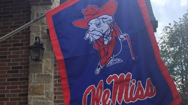
The University of Mississippi is one of a few states in the country to ever use an image of a Confederate army colonel as the logo for the university's athletic teams. Although "Ole Miss" abandoned the logo and the "Colonel Reb" mascot in 2010, fans are not too keen on the replacement "Rebel Black Bear" mascot. The Ole Miss mascot is still technically "The Rebel," despite the school's long history of segregation and racial injustice.
It's not just Ole Miss: other teams such as the UNLV Rebels continue to use confederate imagery in their logos. Did anyone ever ask why a team or university would want to be represented by the side who lost the war? Not to mention Colonel Reb looks like the mascot for a second-tier fried chicken restaurant who is about to get slapped with a lawsuit from KFC.
UCSB Gauchos
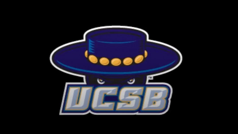
If history went a different way, the University of California, Santa Barbara would not have a spot on this list. According to the university, back in the 1930s a group of female coeds voted to change the name of the school's mascot from the Roadrunners to the Gauchos because they were inspired by silent film actor Douglas Fairbanks' titular character in the 1927 film The Gaucho.
Gauchos are Argentine cowboys, and the students figured that a cowboy would be more fearsome than a skinny-legged bird. (Granted, this was a decade before the Road Runner started to outsmart Wile E. Coyote on the silver screen.) That makes sense, but it's not just a generic cowboy we're talking about here, which is why some people say it's an example of cultural appropriation. It doesn't help that some fans think it's culturally acceptable to toss tortillas on the court or field during a sporting event, even though tortillas have nothing to do with cuisine of Argentina. The current logo depicts a menacing Zorro-like character — why not change it to a nice pair of flowing gaucho pants? That would keep everybody happy, right?