How Colors Got Their Symbolic Meanings

Color is one of those things that we take for granted a lot of the time, and it's easy to forget to look around and enjoy the rainbow that's around us every day. Until we need to make sure our clothes match or pick out some new curtains, how much time do people spend paying attention to color? It's a shame too, because it's pretty incredible that humans evolved to be able to see all these colors in the first place. Ever wonder just why that happened? Science has, too, and there are a few different theories.
One study found that rhesus macaques that have a genetic mutation allowing them to see more colors than their counterparts can find more fruit than those that have standard vision. According to Science, this hints at the theory that humans evolved to be more efficient hunter-gatherers. Neat, right? However, not everyone agrees. Research done by New York University suggests (via Inverse) that humans' ability to see color came from the need to interpret social cues. Specifically, we needed to be able to see a person's face flush in a reaction to something that stimulated them, for better (love) or worse (embarrassment or anger).
And that brings us to our tendency to associate colors with emotions or symbols. We all know, after all, that white is for purity, red is for romance (or rage), and if someone's a coward, they're yellow-bellied, but why?
Purple is the color of royalty
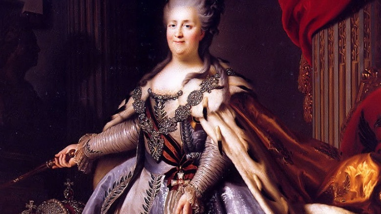
Purple has been associated with royalty for a long time: History says that it goes all the way back to ancient Persia, and famously, later Roman emperors even forbid those who weren't of royal blood from wearing the color. It wasn't just for clothing, either — ancient Byzantine rulers signed their most important documents with purple ink. But why? Simply put, it was almost unthinkably expensive.
This was back in ye olde days of making dyes from various natural substances, and purple was particularly difficult to make. The source of purple dye was almost exclusively in an ancient city called Tyre (what's now Lebanon). Dye-makers would harvest a purple mucus from a type of sea snail, and to put things in perspective, it would take around 1 million sea snails to yield enough raw materials for just 4 ounces of dye.
It kind of goes without saying that buying this dye was outrageously expensive, and enough wool to make a sweater would have cost more than most made in a year. Since only the rich could afford it, only the rich had it, and by the time synthetic, snail-free purple dyes were created in the mid-19th century, the association between purple and royalty had been firmly established.
Yellow: the color of cowardice
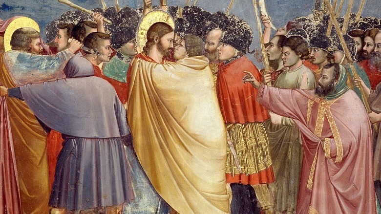
Yellow might be the color of sunny summer afternoons, but it's got a dark side, too. Call someone yellow or yellow-bellied, and it's calling them a coward. It's also the color associated with Judas, who was often dressed in yellow by artists portraying the moment he betrayed Christ. How is the color of the sun also the color of duplicity and cowardice?
For starters, says the BBC, it's the color of urine — and, well, urine's what happens when someone gets super scared, right? But there's a lot more to it than that, and we'll have to look at a color called Indian Yellow. This, too, goes back to the time when colors, dyes, and paints were made from natural substances, and the reported process of making Indian Yellow is nothing short of awful. Indian Yellow was made in a city in Bengal called Monghyr, and it was there that farmers force-fed their cattle a diet of only mango leaves. Not only did that make the cows produce urine that could be dried into a powder, but it also forced them to exist in a near-starvation state.
The story was so widely repeated that yellow became synonymous with suffering, starvation, and brutality. Finally, in 1883, London's Kew Gardens launched an investigation into the practice, and the process was outlawed thanks to their reports of having seen the starving cows first-hand.
Why red is romantic

Red is the color of romance, and not only is it the color of Valentine's Day but there's also the innate allure of a red dress and red lipstick. But why? It's complicated, and more than a little weird.
Let's start with Valentine's Day. That, says Sky History, started out not as a Christian holiday but as the ancient Roman and pagan festival called Lupercalia. Held in honor of the gods of fertility and agriculture, it was kicked off each year with the sacrifice of two goats and a dog. The bloody knife was wiped clean with white wool, and it's thought that this ultimately led to the widespread use of red and white with today's holiday — even though there's considerably less bloodshed.
Psychology professor Sarah Allred says (via Rutgers University) there might be another layer to it, too. She explained that some theorize that red became associated with love because "over our evolutionary history, red was associated with high-intensity objects, such as blood, as well as mate selection." Ever see someone blush when someone else walks into a room and know that there's something going on there? Even animals are thought to judge fertility by the red flush of, shall we say, certain body parts. Those biological reactions, they say, are why red is the color of romance.
Why is blue the color of the Virgin Mary?
Here's one that everyone's seen but might not consciously think about: The Virgin Mary is always dressed in blue. Why?
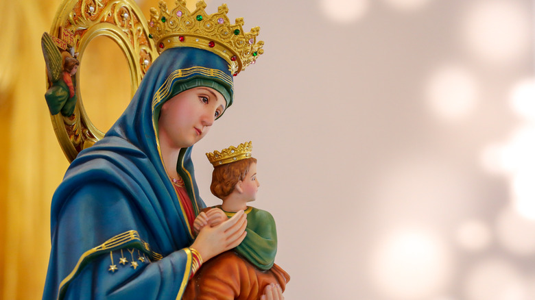
According to The Paris Review, the blue that's often used in Renaissance paintings and on statues of the Virgin Mary is the same color that's often used on the robes of other holy figures and saints to signify they're virginal, good, and essentially exist on a level that's above the rest of us mere mortals. It's called Marian blue, and it comes from a fairly rare, semi-precious stone called lapis lazuli. The ancient Egyptians were the first to use it — where The Guardian says it was reserved for uses like painting Cleopatra's eyes and pharaohs' tombs — and while it slowly became more widely produced, it was still both fairly rare and very expensive.
There was more to it than just the rarity of the pigment, though. Blue is the color of the sky, but look closer to earth, and there's less and less of it. Per The Paris Review, it was a chemist named Heinz Berke who observed that most ordinary people don't have access to blue, and "you don't find it in the soil." Early imagery of Mary tends to depict her wearing red or pink, but in A.D. 431, he was given a new title: "Queen of Heaven, Spiritual Mother, and Intercessor." What better color for her to wear than the color of the sky, so conspicuously absent from beneath our feet?
Pink: the color of seduction
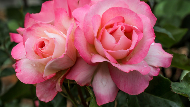
Red might be the color of passionate love, but pink is a little gentler. It's innocent seduction; it's the color of carnations instead of roses, of a gentle sort of love — the kind that cuddles up in front of the fireplace instead of charging right into the bedroom. But why is there such a difference between red and pink? The BBC says that it actually goes back to the art world at a time when various shades of pink were used to represent flesh. That's a pretty clear connection, but the outlet says that when Fra Angelico put the Archangel Gabriel in pink robes, things changed a bit. By wrapping the divine angel in the color of human flesh, pink became what the BBC describes as "shorthand for the blurring of boundaries."
Pink became the color of choice for artists who were doing various versions of that same blurring (for example, putting real-life people in paintings of mythological and legendary stories). Also? For the mistresses of rich and powerful men — another so-called blurring of boundaries. Another great example? The portraits of Louis XV's mistress, Madame de Pompadour — she's dressed in coquettish pink, but she's surrounded by books. It's that latter that really helped cement pick as the color of a gentle sort of seduction. With help from artists, the BBC says de Pompadour "became her color," and it's gone on to represent that sly, self-aware sort of come-hither seduction.
Why white is equated with purity
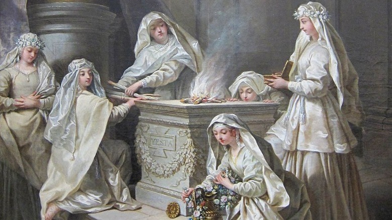
There are a couple of different layers to this one, so let's start with what National Geographic has to say about white being the color of purity. The outlet notes that the idea was a popular one as far back as ancient Rome, when the Vestal Virgins were dressed in white robes to represent their purity of spirit and body. So far, so good, but buckle up, because this is going to get uncomfortable — according to the Nautilus, it was all about race.
While white had started out being associated with the clergy and holy professions like the Vestal Virgins, gradually, that shifted: dirt, after all, shows up really well on white clothes, so wearing white was advertising that someone was clean. That, in turn, became a sign of wealth, as only the rich could keep white clothes clean. Unfortunately, they say this shift from holiness to cleanliness happened at about the same time that Europeans were exploring farther and farther into Africa, and University of Pennsylvania historian Kathleen Brown explains (per Nautilus) that there developed "a new interest in whiteness both as an indicator that clothes were clean, but also a racial indicator of a kind of refinement and civility."
That's the root, she says, not only of white as the color of soap and fluffy bath towels but of racial purity, KKK hoods, and centuries of portraits that emphasize the glowing white skin of Europeans.
Black is the color of death ... isn't it?
Yes, black isn't scientifically a color, etc., etc. For the purposes of talking about color symbolism, though, it's absolutely a color, and it's one that's typically associated with death, the devil, and the mysteriousness of the afterlife.
In 2013, The Washington Post reported on the backlash that was directed as a miniseries called "The Bible," where viewers claimed the devil character was supposed to look like Barack Obama. It wasn't Obama, producers said, but the idea of a dark-skinned devil is rooted in old European folklore that talked about the devil having black skin. That said, the connection between black and the afterlife goes back further.
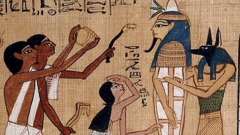
Black, says The Guardian, was the color the ancient Greeks associated with Hades and the afterlife, which makes sense — it was literally underground. Death in ancient Rome was called "the black hour," or "hora nigra," and it was also the color that the ancient Egyptians associated with their god of the afterlife, Anubis (pictured).
But here's where things get a little shady. Anubis wasn't supposed to be scary — he was a protector of the souls of the dead. It was also believed that he oversaw a future where those souls would be resurrected, and there was another reason black was associated with life: it was the color of the fertile soil around the Nile. So, while black ink was once made from the burned bones of the dead, maybe it's not all bad after all.
Feeling blue?
Anyone who's sad is said to be feeling blue, but why? Blue's association with sadness is a fascinating one, and according to HuffPost, we actually know who coined the term "the blues": Washington Irving, who used it in 1807. Surprisingly recent, right? Here's another surprising tidbit: the word "blue" was invented by Chaucer in 1385.
As for the color's connection with sadness and depression, it's likely that it goes back to several old traditions that use blue in the mourning process. For starters, there's the West African tradition of grieving families wearing blue as they mourn their loved ones. The clothing was dyed using the indigo plant, and it imbued indigo with a sorrowful mysticism. (It's also the color of the flag traditionally flown by ships where an officer has died.)
Modern science has discovered there might be even more to it. According to a study published by the Association for Psychological Science (via Science Daily), researchers studying how mood impacts our ability to perceive colors found something startling. In a nutshell, study participants were instructed to watch a film clip that was either funny or sad. Those who watched the sad clips were less capable of identifying colors that were on the blue-yellow color axis, while their perception of colors on the red-green axis wasn't impacted. Surprisingly, that suggests that there just might be an innate, biological connection between human sadness and the color blue. Who would have thought?
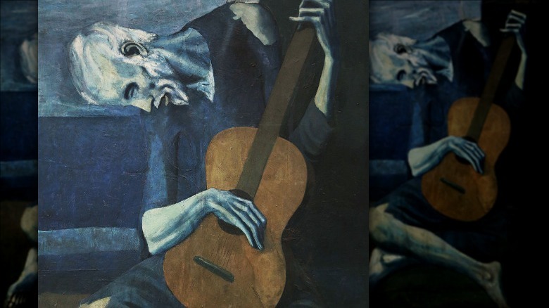
Why is silver always mysterious and a little dark?

Sure, silver is valuable, but it doesn't have the best reputation. Silver jewelry isn't quite as exciting as gold, silver hairs are generally met with a sigh of disappointment, and it tarnishes, right? It's just kind of disappointing, but why? The BBC calls silver "reflective yet guarded," and it's the sort of mysteriousness that's associated with the night and the moon. But there must be more to it than that, right?
Yes, and it has to do with silver metal's tendency to tarnish and change color. By extension, silver isn't seen as trustworthy — just because it's bright and shiny today, that doesn't mean it's not going to tarnish tomorrow. Sound familiar? It should: Silver is also associated with Juda Iscariot (pictured), who turned on Christ for the promise of a few silver coins. Judas turned just like silver does, and that mysteriousness comes from the fact that you just can't trust silver. Whether it's silver jewelry or silver paint pigments, it'll turn on you — just like Judas.
How can green represent both fertility and poison?
Green is kind of weird: It represents growth, regeneration, and rejuvenation as well as decay, rot, and poison.
According to the BBC, the dual nature of green goes all the way back to ancient Egypt. There, it was associated with Osiris, the god of life and death, who ruled over the border between the living and the dead and watched over the souls who crossed that border. At the same time that he watched the seasons change and nature fade, he was the one who brought the life-giving floods of the Nile and guided souls along the path to resurrection.
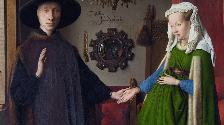
Green, the BBC adds, has been associated with life for as long as settlements have been relying on agriculture as a main source of food. Jade beads, totems, and masks were made with the hopes of ensuring a bountiful harvest, and Muhammad called it the most beautiful color of them all — in a desert of browns and yellows, green was life. It's also the color of algae, of murky waters, and of lichen. Artworks use green to depict life and stagnant decay, and perhaps the most oft-debated work is Jan van Eyck's "The Arnolfini Portrait," where a woman stands, clad in a green dress. While some suggest the color signifies she's pregnant, others add in the symbolism seen around her to come to a different conclusion — it's a memorial painting, and she has passed on.
Pink is for boys, and blue is for girls. Wait, what?
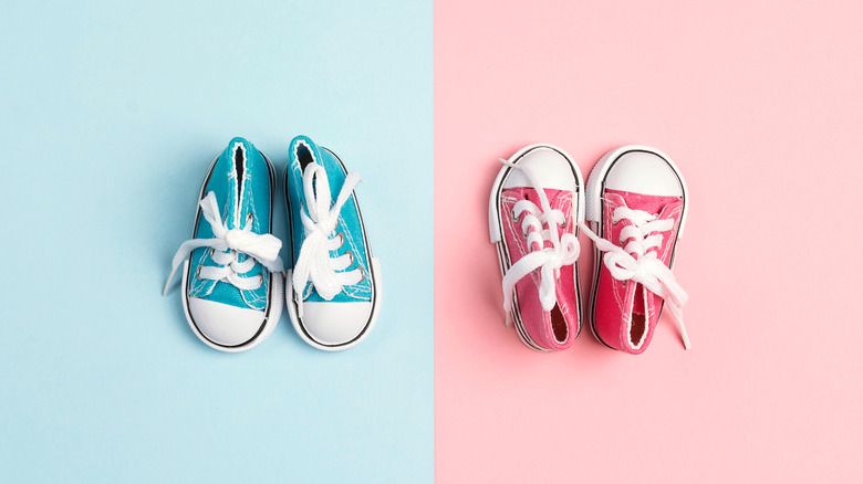
It's kind of weird when you think about it: People tend to be super concerned about the sex of a baby, to the point where it's the most important thing in the whole wide world. Just look at the trend of gender reveal parties: Parents are striving toward bigger and bolder ways to announce the sex of their babies, to the point where they're willing to start wildfires to do it. Pink is for a girl, and blue is for a boy, but why?
The Smithsonian says that it's a fairly recent thing. After generations of children were raised wearing white dresses until they were about 6 years old — mostly for practical reasons, as white was easy to clean with bleach — pastels became all the rage in the mid-1800s. Still, it wasn't until World War I that color became something that was separated by sex and gender, and parents were told to dress their boys in pink and girls in blue. Why? Per Smithsonian, pink is "a more decided and stronger color," while blue is "more delicate and dainty."
That didn't switch until the 1940s when children were seen as miniature versions of their parents. According to the University of Missouri-Kansas City, pink became the go-to for girls because it's "a romantic color" and "more emotional." Yikes? Yikes. Although recent ideas about gender are trying to overturn the rather narrow view, things like gender reveal parties suggest it's still alive and well.
Seeing red?

If someone's really, really angry, they're said to be seeing red. In addition to being the color of romance, it's the color of anger and aggression, and while the two might not seem to go hand in hand, they kind of do.
According to research published via PLOS One, the idea of red and anger has often been associated with the flush of a very, very angry face. Similar to the way a flush might indicate attraction, it can also indicate things are about to get very rage-y very quickly. Other research from North Dakota University suggests (via The Independent) that there really is a connection between anger (and generally hostile personalities) and the color red. One study showed participants pictures that were neither red nor blue, and when asked what color they saw, it was the angry people who more frequently answered, "Red." Neat, right? People with more hostile personalities were also more likely to cite red as their favorite color, and when they were given a series of scenarios and asked what they were likely to do in those situations, red-favoring people were more likely to choose the more harmful, aggressive outcome.
It's entirely possible that humankind has been hard-wired to associate red with anger and violence. After all, red can act as a warning, whether it's in the form of blood or poisonous berries. We know by now not to mess with red.
Does brown make you feel a certain way? You're not alone
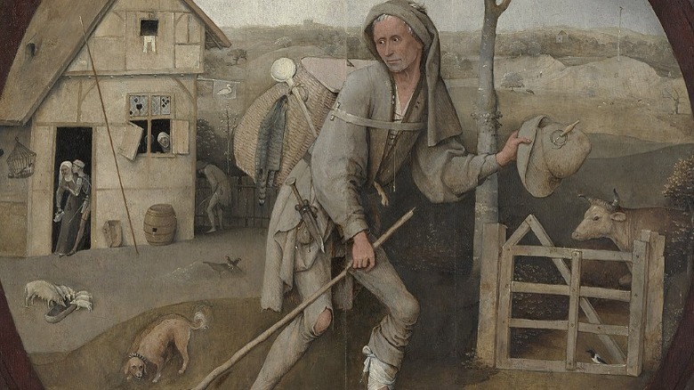
Brown might not have the same kind of knee-jerk associations that red and blue do, but according to the BBC, brown — or rather, a specific shade of brown called umber — has been used to depict the shadowy underbelly of the world for centuries. When it's featured in a painting, the viewer can almost feel that there's something sinful going on, and historians say that it's something perfectly illustrated by Hieronymus Bosch's "The Wayfarer" (pictured). He's looking ahead to his life on the road of respectability, but behind him? Clearly, he finds that brothel pretty tempting.
After Bosch used it in a work symbolizing the subject's inner turmoil and indecision over choosing a life of sin or virtue, it started popping up in other works, used the same way. Raphael's portrait of Catherine captured her at the moment when she contemplated the choice between forsaking her faith and martyrdom after torture on the wheel, and by the end of the 1500s, the use of umber had become a popular one for artists wanting to depict a person at the crossroads of their lives.
If looking at any painting that uses the color umber makes you feel as though you're looking at the in-between, that's by design.