

Classic Rock Albums That Came With Seriously Cool Extras
Few material pleasures in life can surpass the thrill of opening up an album — taking the shrink wrap off, sliding the record carefully out of its sleeve, and dropping the needle while looking through the package notes and illustrations. Who are the people on some of those albums? What do those design choices really mean? Which covers can double as a work of art? The variety of answers from collectors is what makes adding to your record shelves that much more exciting.
A record doesn't just change your life and outlook from its grooves alone. Sometimes, you open up an L.P. and find some real-life treasure of your own, from bonus songs to color-changing sleeves. Some records even have their own scent that you won't soon forget! Here are five of our favorite albums with a little extra something inside the sleeves, making the setup of a listening session as exciting as the payoff.
The Rolling Stones — Exile on Main St.
Along with their contemporaries, the Beatles, British rockers the Rolling Stones set some gold standards for album packaging in the late '60s and early '70s, from the almost surreal "record stack" adorning the cover of "Let It Bleed" to the infamous sleeve for "Sticky Fingers," which set a new standard for album artwork gimmickry with its workable zipper on the fly of a worn pair of jeans.
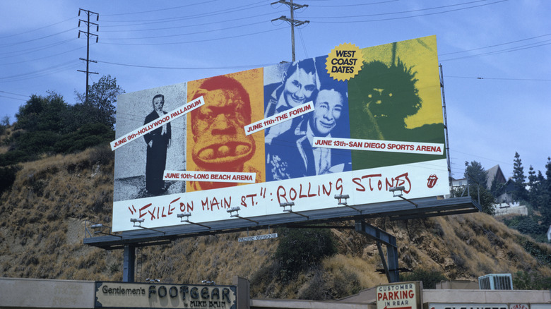
The Stones weren't about to take it easy from there: Their next album, "Exile on Main St.," was an ambitious 18-song work stretched across two vinyl discs. While the "Exile" package was more low-key than its predecessors, it was a seriously cool mix of photography that matched the album's tone. The sleeve mixed old and new photographs by Robert Frank in a collage-style package designed by John Van Hamersveld, in what Headphone Nation described as frontman Mick Jagger's "want[ing] its album cover to reflect the band as runaway outlaws using the blues as its weapon against the world."
Inside the package was a bonus set of band shots taken by Norman Seeff of a staged, ship-themed photo shoot in Hollywood. They were presented as a perforated sheet of 12 photos, suitable for framing or pinning to a wall while you grooved to the sound of "Exile" standouts like "Tumbling Dice" or "Shine a Light."
Stevie Wonder — Songs in the Key of Life
Stevie Wonder was something special from the beginning. The blind singer/songwriter/multi-instrumentalist made history as the youngest solo artist to reach No. 1 on the U.S. album chart. (He was only 13 at the time.) As he became an adult, successfully challenging Motown Records for creative control, he embarked on a creative streak with few equals, releasing the acclaimed L.P.s "Talking Book," "Innervisions," and "Fulfillingness' First Finale" at a rapid, annual pace between 1972 and 1974. Though 1975 came and went without a new album, he made up for it a year later with "Songs in the Key of Life," an ambitious and wildly popular double album that spun off the No. 1 hits "Sir Duke" and "I Wish" as well as the radio favorite "Isn't She Lovely."
Of course, careful listeners know that "Songs in the Key of Life" actually has a little more than that. Wonder was so rich with ideas that, in addition to the 17 songs on four sides of vinyl, the album came with a bonus 7" E.P. featuring another four tracks. Titled "A Something's Extra," the disc featured even more great songs like "Saturn," a dreamy vision of a better life beyond Earth, and the relaxing instrumental "Easy Goin' Evening (My Mama's Call)." Thanks in no small part to this ambitious EP, "Songs in the Key of Life" became Wonder's third release in a row to win a Grammy Award for album of the year.
Led Zeppelin — In Through the Out Door
You can explain the story of Led Zeppelin in 11 songs, but you can also get a sense of how unlike any rock 'n' roll band they were through their album art. From the in-your-face depiction of the Hindenburg disaster on their 1969 debut album to their fourth album, known by its unpronounceable symbols, how the band's music was packaged was almost as interesting as the unbelievable riffs they wrote.
Beginning with "Houses of the Holy" in 1973, Led Zeppelin began working with acclaimed design firm Hipgnosis on their album sleeves — and on the group's penultimate album, 1979's "In Through the Out Door," the designers may have outdone themselves. Original buyers who opened the brown paper packaging were confronted with one of six different angles of a scene at a bar, with each photo printed in sepia tones with a brushstroke of color in the middle of the image. That design quirk was a hint to the package's greatest secret: If you got the inner sleeve of the album wet (the part holding the record, that is), it would change from black and white to color thanks to an invisible ink printing. This dazzling display earned Hipgnosis designer Aubrey Powell a Grammy nomination for best album package.
Madonna — Like a Prayer
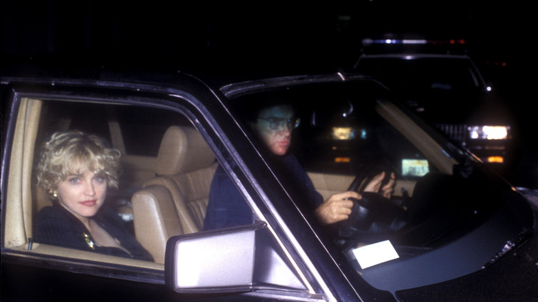
Madonna was well established as one of the most successful female performers of the '80s (a world record holder several times over) before the decade was over. But her fourth album, 1989's "Like a Prayer," took things to a new level. The album and its videos addressed serious topics including the church, female empowerment, and divorce (namely her own, from actor Sean Penn) — and while the title track's controversial music video cost her an endorsement deal with Pepsi, the non-stop dance-pop perfection of hits like "Express Yourself" and "Cherish" set her up for some of her greatest success.
And her artistic vision extended well past MTV and into the deepest recesses of the "Prayer" album package. With the AIDS crisis raging at the end of the decade, Madonna included a fact sheet about the "equal opportunity disease," expressing her support for victims of the epidemic at a time when few celebrities did. She also extended the album's church-like undertones by scenting original pressings with patchouli oil. "She wanted to create a sensual feeling you could hear and smell," a representative for her label, Warner Bros., explained at the time (as reported by Yahoo!). The scent is so strong that some say you can still smell it coming from used copies at your favorite record store.
Weezer — Coloring Book

Weezer has never shied away from a gimmick; consider the video to their early favorite "Buddy Holly," where they inserted themselves into an episode of "Happy Days." But the band didn't originally intend to have their 1994 debut album — featuring the four band members on a blue background — known as anything but "Weezer." (Despite its popularity, the band was uncomfortable with how that album turned out.) Seven years later, when they reunited with the Cars' Ric Ocasek to produce their third record, they decided the back-to-basics music needed a similar package, and the 2001 release was sold with just the band and their name on the cover, this time against a green background.
The alt-rockers have used this trick several times whenever it's time for a reset, most recently in 2026 for their 20th album, released with a gold cover. But that same year, they flipped the script for a special vinyl box set. "Coloring Book" featured vinyl versions of their earlier self-titled albums, released in 1994 (blue), 2001 (green), 2008 (red), 2016 (white), and 2019 (both teal and black). Each was pressed on the colors of the original album covers — but the packaging itself featured black-and-white illustrated pages and a set of markers. Fans could make the covers look however they wanted, and even had a "magic" marker that would reveal certain images on the package when colored in.